Con el diseñador de impresión se pueden crear buenos mapas y atlas que se pueden imprimir o guardar como archivo PDF, una imagen o un archivo SVG. Esta es una manera potente para compartir información geográfica producida con QGIS que se puede incluir en reportes o publicado.
El diseño de impresión ofrece crecientes capacidades de diseño e impresión. Se le permite añadir elementos a la vista del QGIS como, etiquetas de texto, imágenes, leyendas, barras de escala, formas básicas, flechas, tablas de atributos y marcos HTML. Puede cambiar el tamaño, grupo, alineación y posición de cada elemento y ajustar las propiedades para crear su diseño. El diseño se puede imprimir o exportar a formatos de imagen, PostScript, PDF o SVG (la exportación de SVG no funciona correctamente con algunas versiones recientes Qt4, debe intentarlo y comprobar de forma individual en el sistema). Puede guardar el diseño como una plantilla y cargarla de nuevo en otra sesión. Por último, la generación de varios mapas basados en una plantilla se puede hacer a través del generador de atlas. Ver una lista de herramientas en table_composer_1:
Todas las herramientas del diseñador de impresión estan disponibles en los menús y como iconos en la barra de herramientas. La barra de herramientas se puede prender y apagar utilizando el botón derecho del ratón sobre la barra de herramientas.
Primeros pasos
Abrir una plantilla del diseñador de impresión
Antes de comenzar a trabajar con el Diseñador de impresión, debe cargar algunas capas ráster y vectoriales a la vista del del mapa de QGIS y adaptar sus propiedades para ajustar a su propia conveniencia. Después de todo lo que se representa y simboliza a su gusto, haga clic en el icono  Nuevo diseño de impresión en la barra de herramientas o seleccione :menuselection:` Proyecto-> Nuevo diseñador de impresión`. Se le pedirá que elija un título para la nuevo diseño.
Perspectiva general del Diseñador de impresión
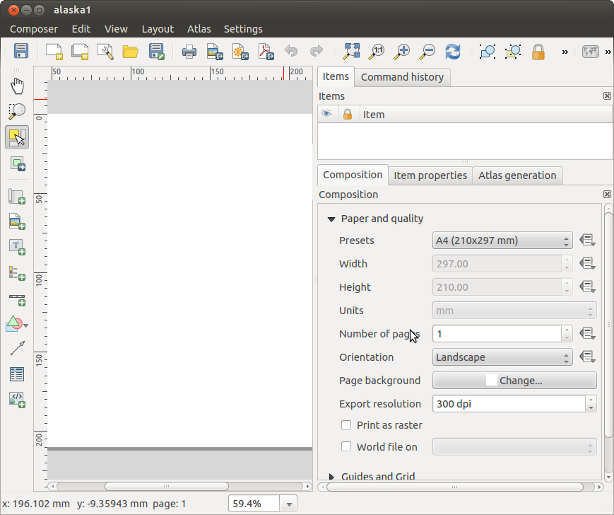
Al abrir el Diseñador de impresión le proporciona un lienzo en blanco que representa la superficie del papel al usar la opción de impresión . Inicialmente se encuentra botones del lado izquierdo del lienzo para añadir elementos al mapa del diseño; el lienzo del mapa actual de QGIS, etiquetas de texto, imágenes, leyendas, barras de escala, formas básicas, flechas, tablas de atributos y marcos HTML. En esta barra de herramientas también se encuentran los botones de barra de herramientas para navegar, acercar zum sobre un área y desplazar la vista y los botones de la barra de herramientas para seleccionar un elemento del diseñador del mapa y mover el contenido del elemento del mapa.
Figure_composer_overview shows la vista inicial del Diseño de impresión se añade antes que cualquier otro elemento.
Figure Composer Overview:
Del lado derecho del lienzo encontrará dos paneles. El panel superior tiene las pestañas Elementos e Historia de la orden y el panel inferior tiene las pestañas Diseño, Propiedades del elemento y Generación de atlas.
La pestaña Elementos proporciona una lista de todos los elementos del diseño añadidos al lienzo.
La pestaña Historia de la orden muestra una historia de todos los cambios aplicados al diseño. Con hacer un clic, es posible deshacer y rehacer pasos de ida y de vuelta a un cierto estatus
La pestaña Diseño le permite establecer el tamaño del papel, orientación, fondo de la página, número de páginas y calidad de impresión para el archivo de salida en dpi. Además, también se puede activar la casilla  Imprimir como ráster. Esto significa que todos los elementos serán convertidos a ráster antes de imprimirse o guardarse como PostScript o PDF. En esta pestaña, también puede personalizar la configuración de la cuadrícula o guías inteligentes.
La pestaña Propiedades del elemento muestra las propiedades del elemento seleccionado. Haga clic en el icono  Seleccionar/Mover elemento para mover un elemento (por ejemplo, la leyenda, la barra de escala o etiqueta) en el lienzo. Después haga clic en la pestaña Propiedades del elemento y personalice la configuración del elemento seleccionado.
La pestaña Generación de atlas le permite habilitar la generación de un atlas del diseño actual y da acceso a sus parámetros.
Por último, puede guardar su diseño de impresión con el botón  Guardar proyecto.
En la parte inferior de la ventana del Diseñador de impresión, puede encontrar una barra de estado con la posición del ratón, número de página actual y una lista desplegable para establecer el nivel de zum.
Puede añadir múltiples elementos al diseño de impresión. También es posible tener más de una vista de mapa o leyenda o barra de escala en el lienzo, en una o varias páginas. Cada elemento tiene sus propias propiedades y, en caso del mapa, su extensión. Si quiere borrar algún elemento del lienzo, puede hacerlo con Eliminar o la tecla Retroceso.
Ejemplo de sesión
Para demostrar cómo crear un mapa, por favor siga las siguientes instrucciones.
En el lado izquierdo, seleccione el botón de la barra de herramientas  Añadir un nuevo mapa y dibuje un rectángulo en el lienzo manteniendo pulsado el botón izquierdo del ratón. Dentro del rectángulo dibujado la vista de mapa de QGIS al lienzo.
Seleccione el botón de la barra de herramientas  Añadir nueva barra de escala y ubicar el elemento del mapa con el botón izquierdo del ratón en el lienzo del diseñador de impresión. Una barra de escala se añadirá al lienzo.
Seleccione el botón de la barra de herramientas  Añadir nueva leyenda y dibuje un rectángulo en el lienzo manteniendo pulsado el botón izquierdo del ratón. Dentro del rectángulo dibujado se dibujará la leyenda.
Elija el icono Seleccionar/Mover elemento para seleccionar el mapa en el lienzo y moverlo un poco.
Mientras el elemento del mapa aun esta seleccionado, también se puede cambiar el tamaño del elemento mapa. Haga clic mientras mantiene pulsado el botón izquierdo del ratón, en un pequeño rectángulo blanco en una de las esquinas del elemento mapa y dibuje a una nueva ubicación para cambiar su tamaño.
Haga clic en la pestaña Propiedades del elemento en el panel inferior izquierdo y encuentre el ajuste para la orientación. Cambiar el valor del ajuste Orientación del mapa a ‘15.00|grados| ‘. Debe ver la orientación del elemento mapa que cambio.
Por último, puede guardar su diseño de impresión con el botón Guardar proyecto.
Opciones del diseñador de impresión
De se pueden establecer algunas opciones que se utilizarán por defecto durante su trabajo.
Predeterminados de la Composición le permite especificar la fuente predeterminada a utilizar.
Con Aspecto de la cuadrícula, se puede establecer el estilo de la cuadrícula y el color.
Predeterminados de la cuadrícula se define separación, desplazamiento y tolerancia de la cuadrícula. Hay tres tipos de cuadrícula: Puntos, Sólido y Cruces.
Predeterminados de las guías se define la tolerancia de autoensamblado para las guías.
Pestaña de Diseño — Configuración general de diseño
En la pestaña Diseño, puede definir la configuración global de su diseño.
Puede elegir uno de los Preestablecidos para su hoja de papel, o ingrese su Anchura y Altura personalizado.
La composición ahora se puede dividir en varias páginas. Por ejemplo, una primer página puede mostrar una vista del mapa, y una segunda página puede mostrar la tabla de atributos asociada a la capa, mientras que una tercera página muestra un marco HTML enlazado a su página web de su organización. Establecer el Número de páginas al valor deseado. Puede elegir la página Orientación y su Resolución de exportación. Cuando se activa, Imprimir como ráster significa que todos los elementos serán rásterizados antes de imprimir o guardar como PostScript o PDF.
Cuadrícula le permite personalizar la configuración de la cuadrícula como Separación, Desplazamiento y Tolerancia a sus necesidades.
En Autoensamblar a las alineaciones, se puede cambiar la Tolerancia, que es la distancia máxima por debajo de la cual un elemento se ajustan a las guías inteligentes.
Ajustar a la cuadrícula y/o Guías inteligentes se pueden habilitar desde el menú . En este menú, también se puede ocultar o mostrar la cuadrícula o guías inteligentes.
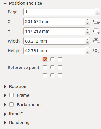
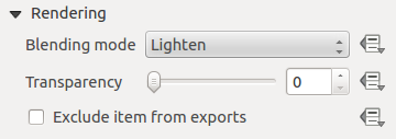
Opciones comunes en los elementos del diseñador
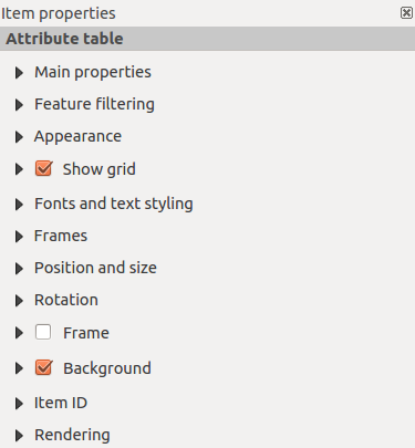
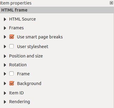
Los elementos del diseñador tienen un conjunto de propiedades comunes que se encontrará en la parte inferior de la pestaña Propiedades del elemento: Posición y tamaño, Rotación, Marco, Fondo, ID del elemento y Representación (Ver figure_composer_common_1).
Figure Composer Common 1:
El diálogo Posición y tamaño le permite definir tamaño y posición del marco que contiene los elementos. También puede optar por Punto de referencia para establecer las coordenadas X y Y previamente definidas.
La Rotación establece la rotación del elemento (en grados).
El Marco muestra u oculta el marco alrededor de la etiqueta. Haga clic en los botones [Color] y [Delgadez] para ajustar esas propiedades.
El Fondo se activa o desactiva un color de fondo. Haga clic en el botón [Color...] para mostrar un diálogo donde puede escoger un color o elegir de una configuración personalizada. La transparencia también se puede ajustar hasta alcanzar el campo Canal alfa.
Utilice el ID del elemento para crear una relación a otros elementos del Diseñador de impresión. Esto se utiliza con el servidor QGIS y algunos clientes web potenciales. Puede establecer un ID a un elemento (por ejemplo, un mapa y una etiqueta), y después el cliente web puede enviar datos para establecer una propiedad (por ejemplo, etiqueta de texto) para ese elemento especifico. El comando GetProjectSettings listará que elementos y que ID’s están disponibles en un diseño.
Modo Representación se puede seleccionar en el campo de opción. Ver Rendering_Mode.
Nota
Si checa Utilice diálogo seleccionador de color en las opciones generales de QGIS, el botón de color se actualizará tan pronto como elija un nuevo color desde la ventana Diálogo de Color. Si no, debe cerrar el Diálogo de color.
El de a lado icono  Anular datos definidos de campo significa que se puede asociar el campo con datos en el elemento del mapa o utilizar expresiones. Estos son particularmente útiles con la generación de atlas (vea atlas_data_defined_overrides)
Elementos de diseño
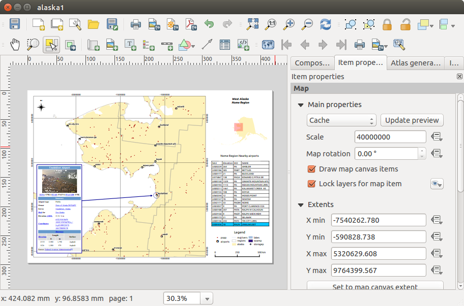
El elemento del mapa
Haga clic en el botón de la barra de herramientas Añadir nuevo mapa en la barra de herramientas del Diseñador de impresión para agregar una vista del mapa de QGIS. Ahora, arrastre un rectángulo sobre el lienzo del Diseñador con el botón izquierdo del ratón para añadir el mapa. Para mostrar el mapa actual, se puede elegir entre tres modos diferentes en el mapa, la pestaña Propiedades del elemento:
Rectángulo es la configuración predeterminada. Solo muestra una caja vacía con un mensaje ‘El mapa será impreso aquí’.
Cache representa el mapa en la resolución de la pantalla actual. Si se acerca o aleja el zum en la ventana del Diseñado, el mapa no representara de nuevo pero la imagen será escalada.
Representar quiere decir que si se acerca o aleja el zum en la ventana del Diseñador, el mapa será representado de nuevo, pero por razones de espacio sólo hasta una resolución máxima.
Cache es el modo de vista previa predeterminado para añadir los recientes mapas al Diseñador de impresión.
Puede cambiar el tamaño del elemento del mapa al hacer clic en el botón Seleccionar/Mover elemento, seleccione el elemento, y arrastre una de las asas de color azul en la esquina del mapa. Con el mapa seleccionado, ahora se puede ajustar más propiedades en el mapa, en la pestaña Propiedades del elemento.
Para desplazar capas dentro del elemento del mapa, seleccione el mapa, haga clic en el icono  Mover contenido del elemento y mueva las capas dentro del marco del elemento mapa con el botón izquierdo del ratón. Después de encontrar el lugar apropiado para un elemento, puede bloquear la posición dentro del lienzo del Diseñador de impresión. Seleccione el elemento mapa y utilice la barra de herramientas
  Bloquear elementos seleccionados o la pestaña . Una vez seleccionado puede utilizar la pestaña para desbloquear elementos individuales. El icono
  Desbloquear todos los elementos desbloqueará todos los elementos del diseñador bloqueados.
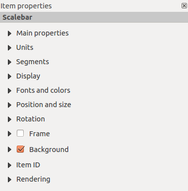
Propiedades principales
El diálogo Propiedades principales del mapa, la pestaña Propiedades del mapa proporciona las siguientes funcionalidades (vea figure_composer_map_1)
Figure Composer Map 1:
Extensión
El diálogo Extensión de la pestaña del elemento mapa proporciona las funcionalidades siguientes (ver figure_composer_map_2):
Figure Composer Map 2:
La zona Extensión del Mapa le permite especificar la extensión del mapa utilizando los valores X y Y máximos y mínimos al hacer clic en el botón [Establecer a la extensión de la vista del mapa]. Este botón establece la extensión del elemento mapa del diseñador a la extensión de la vista del mapa actual en la aplicación principal QGIS. El botón [Extender vista en la vista del mapa] hace exactamente lo opuesto, actualiza la extensión de la vista del mapa en la aplicación QGIS a la extensión del elemento mapa del diseñador.
Si se cambia la vista en la vista del mapa QGIS al cambiar al cambiar las propiedades vectoriales o ráster. se puede actualizar la vista del Diseñador de impresión seleccionando el elemento mapa en el Diseñador y al hacer clic en el botón **[Actualizar vista preliminar]**en la pestaña del mapa Propiedades del elemento (ver figure_composer_map_1).
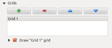
Cuadrículas
El diálogo Cuadrículas de la pestaña del mapa Propiedades del elemento provee la posibilidad de añadir varias cuadrículas para un elemento mapa.
Al hacer doble clic sobre la rejilla seleccionada se le puede dar otro nombre.
Figure Composer Map 3:
Después de agregar una rejilla, se puede activar la casilla de verificación Mostrar rejilla para sobreponer una rejilla sobre el elemento del mapa. Ampliar esta opción proporciona muchas opciones de configuración, consulte Figure_composer_map_4.
Figure Composer Map 4:
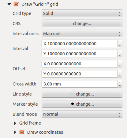
Como tipo de rejilla, se puede especificar para utiliza línea sólida o cruz. La simbología de la cuadrícula se puede elegir. Consulte la sección Rendering_Mode. Además, se puede definir un intervalo en las direcciones X y Y, una X y Y compensados, y el ancho se utiliza para la cruz o linea de tipo rejilla.
Figure Composer Map 5:
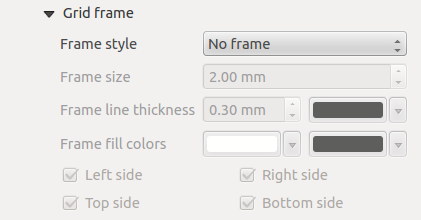
Hay diferentes opciones para estilos del marco que sostiene el mapa. Las siguientes opciones están disponibles: Sin marco, Zebra, ticks interiores, ticks exteriores, Stick interior y exterior, línea de borde.
Modo de representación avanzada también esta disponible para cuadriculas (consulte sección Rendering_mode).
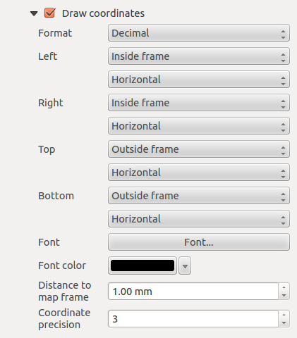
- The Draw coordinates checkbox allows you to add coordinates
to the map frame. The annotation can be drawn inside or outside the map frame.
The annotation direction can be defined as horizontal, vertical, horizontal and
vertical, or boundary direction, for each border individually. Units can be in meters or in degrees. Finally, you can define the grid
color, the annotation font, the annotation distance from the map frame and the precision of the drawn coordinates.
Figure Composer map 6:
Vistas generales
The Overviews dialog of the map Item Properties tab provides the
following functionalities:
Figure Composer Map 7:
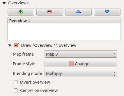
You can choose to create an overview map, which shows the extents of the other map(s)
that are available in the composer. First you need to create the map(s) you want to
include in the overview map. Next you create the map you want to use as the overview
map, just like a normal map.
Open Overviews and press the green plus icon-button to add an overview.
Initially this overview is named ‘Overview 1’ (see Figure_composer_map_7).
You can change the name when you double-click on the overview item in the list
named ‘Overview 1’ and change it to another name.
Cuando seleccione el elemento de vista general en la lista se puede personalizar.
El Dibujar”<name_overview>” vista general necesita estar activado para dibujar la extensión del marco de mapa seleccionado.
La lista desplegable Marco de mapa se puede utilizar para seleccionar el elemento mapa, cuya extensión será dibujada en el elemento de mapa presente.
El Estilo de marco le permite cambiar el estilo de del marco de vista general.
El Modo de mezcla le permite establecer diferentes modos de mezcla de transparencia. Consulte Rendering_Mode.
- The Invert overview creates a mask around the extents when
activated: the referenced map extents are shown clearly, whereas everything else
is blended with the frame color.
- The Center on overview puts the extent of the overview frame in
the center of the overview map. You can only activate one overview item to center, when
you have added several overviews.
El elemento etiqueta
To add a label, click the  Add label icon, place the element
with the left mouse button on the Print Composer canvas and position and customize
its appearance in the label Item Properties tab.
Add label icon, place the element
with the left mouse button on the Print Composer canvas and position and customize
its appearance in the label Item Properties tab.
The Item Properties tab of a label item provides the following functionality
for the label item (see Figure_composer_label):
Figure Composer 8:
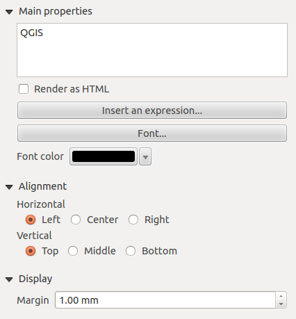
Propiedades principales
- The main properties dialog is where the text (HTML or not) or the expression
needed to fill the label is added to the Composer canvas.
- Labels can be interpreted as HTML code: check Render as HTML.
You can now insert a URL, a clickable image that links to a web page or something more complex.
- You can also insert an expression. Click on [Insert an expression] to open a new dialog.
Build an expression by clicking the functions available in the left side of the panel.
Two special categories can be useful, particularly associated with the atlas functionality:
geometry functions and records functions. At the bottom, a preview of the expression is shown.
- Define Font by clicking on the [Font...] button or a Font color
selecting a color using the color selection tool.
Alineación y visualización
- You can define the horizontal and vertical alignment in the Alignment zone.
- In the Display tag, you can define a margin in mm. This is the margin from the edge of the composer item.
El elemento imagen
To add an image, click the  Add image icon, place the element
with the left mouse button on the Print Composer canvas and position and customize
its appearance in the image Item Properties tab.
Add image icon, place the element
with the left mouse button on the Print Composer canvas and position and customize
its appearance in the image Item Properties tab.
The image Item Properties tab provides the following functionalities (see figure_composer_image_1):
Figure Composer image 1:
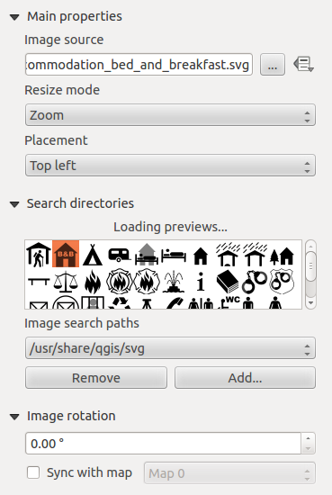
You first have to select the image you want to display.
There are several ways to set the image source in the Main properties area.
- Use the browse button
 of image source to select a file on your
computer using the browse dialog. The browser will start in the SVG-libraries provided with QGIS.
Besides SVG, you can also select other image formats like .png or .jpg.
of image source to select a file on your
computer using the browse dialog. The browser will start in the SVG-libraries provided with QGIS.
Besides SVG, you can also select other image formats like .png or .jpg.
- You can enter the source directly in the image source text field. You can even provide
a remote URL-address to an image.
- From the Search directories area you can also select an image from loading preview..
to set the image source.
- Use the data defined button to set the image source from a record or using a
regular expression.
With the Resize mode option, you can set how the image is displayed when the frame
is changed, or choose to resize the frame of the image item so it matches the original size of
the image.
Se puede seleccionar uno de los siguientes modos:
- Zoom: Enlarges the image to the frame while maintaining aspect ratio of picture.
- Stretch: Stretches image to fit inside the frame, ignores aspect ratio.
- Clip: Use this mode for raster images only, it sets the size of the image to original image size
without scaling and the frame is used to clip the image, so only the part of the image inside the
frame is visible.
- Zoom and resize frame: Enlarges image to fit frame, then resizes frame to fit resultant image.
- Resize frame to image size: Sets size of frame to match original size of image without scaling.
Selected resize mode can disable the item options ‘Placement’ and ‘Image rotation’.
The Image rotation is active for the resize mode ‘Zoom’ and ‘Clip’.
With Placement you can select the position of the image inside it’s frame.
The Search directories area allows you to add and remove directories with images in SVG format
to the picture database. A preview of the pictures found in the selected directories is shown in a
pane and can be used to select and set the image source.
Images can be rotated with the Image rotation field.
Activating the Sync with map checkbox synchronizes the rotation of a picture
in the QGIS map canvas (i.e., a rotated north arrow) with the appropriate Print Composer image.
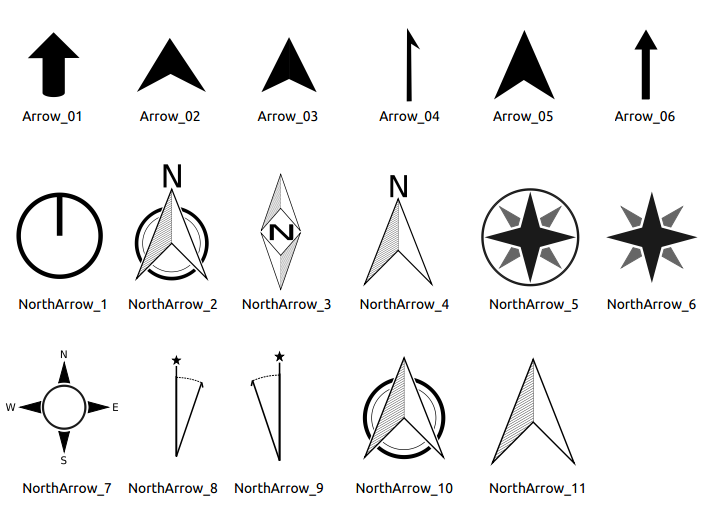
It is also possible to select a north arrow directly. If you first select a north arrow image from
Search directories and then use the browse button of the field Image source,
you can now select one of the north arrow from the list as displayed in figure_composer_image_2.
Nota
Many of the north arrows do not have an ‘N’ added in the north arrow, this is done on
purpose for languages that do not use an ‘N’ for North, so they can use another letter.
Figure Composer Image 2:
El elemento leyenda
To add a map legend, click the Add new legend icon,
place the element with the left mouse button on the Print Composer canvas and
position and customize the appearance in the legend Item Properties
tab.
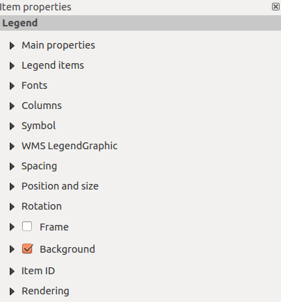
The Item properties of a legend item tab provides the following
functionalities (see figure_composer_legend_1):
Figure Composer Legend 1:
Propiedades principales
The Main properties dialog of the legend Item Properties tab
provides the following functionalities (see figure_composer_legend_2):
Figure Composer Legend 2:
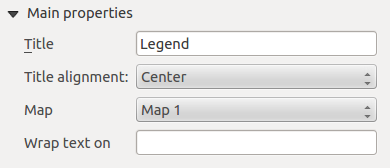
En propiedades principales se puede:
Cambiar el título de la leyenda.
Establecer la alineación del título a la Izquierda, Centro o Derecha
Puede elegir que elemento Mapa de la leyenda actual se referirá a la lista de selección.
- You can wrap the text of the legend title on a given character.
Elementos de la leyenda
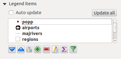
The Legend items dialog of the legend Item Properties tab
provides the following functionalities (see figure_composer_legend_3):
Figure Composer Legend 3:
The legend will be updated automatically if Auto-update is checked.
When Auto-update is unchecked this will give you more control over the legend items.
The icons below the legend items list will be activated.
The legend items window lists all legend items and allows you to change item order,
group layers, remove and restore items in the list, edit layer names and add a filter.
- The item order can be changed using the [Up] and [Down] buttons or with ‘drag-and-drop’
functionality. The order can not be changed for WMS legend graphics.
- Use the [Add group] button to add a legend group.
- Use the [plus] and [minus] button to add or remove layers.
- The [Edit] button is used to edit the layer-, groupname or title, first you need to
select the legend item.
- The [Sigma] button adds a feature count for each vector layer.
- Use the [filter] button the filter the legend by map content, only the legend items visible
in the map will be listed in the legend.
After changing the symbology in the QGIS main window, you can click on [Update] to
adapt the changes in the legend element of the Print Composer.
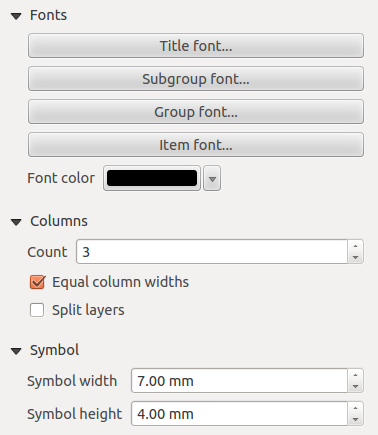
Fuentes, Columnas, Símbolo
The Fonts, Columns and Symbol dialogs of the legend
Item Properties tab provide the following functionalities (see figure_composer_legend_4):
Figure Composer Legend 4:
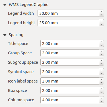
WMS legendGraphic and Spacing
The WMS legendGraphic and Spacing dialogs of the legend
Item Properties tab provide the following functionalities (see
figure_composer_legend_5):
Figure Composer Legend 5:
When you have added a WMS layer and you insert a legend composer item, a request will be send to the
WMS server to provide a WMS legend, This Legend will only be shown if the WMS server provides the
GetLegendGraphic capability. The WMS legend content will be provided as a raster image.
WMS legendGraphic is used to be able to adjust the Legend width and
the legend hight of the WMS legend raster image.
Spacing around title, group, subgroup, symbol, icon label, box space or column space can be customized
through this dialog.
El elemento de barra de escala
To add a scale bar, click the Add new scalebar icon, place
the element with the left mouse button on the Print Composer canvas and position
and customize the appearance in the scale bar Item Properties tab.
The Item properties of a scale bar item tab provides the following
functionalities (see figure_composer_scalebar_1):
Figure Composer Scalebar 1:
Propiedades principales
The Main properties dialog of the scale bar Item Properties tab
provides the following functionalities (see figure_composer_scalebar_2):
Figure Composer Scalebar 2:
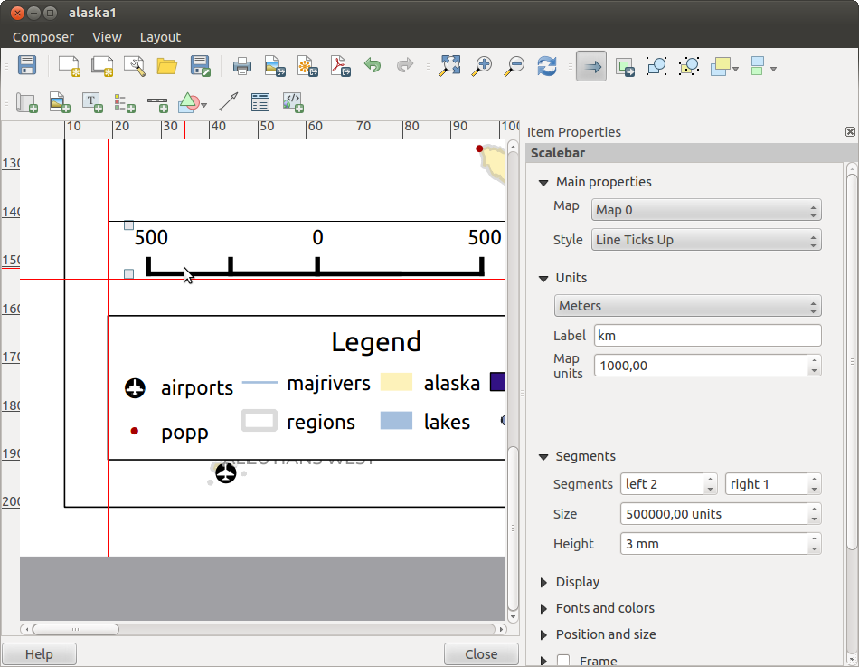
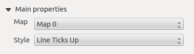
Unidades y Segmentos
The Units and Segments dialogs of the scale bar Item Properties tab
provide the following functionalities (see figure_composer_scalebar_3):
Figure Composer scalebar 3:
In these two dialogs, you can set how the scale bar will be represented.
- Select the map units used. There are four possible choices: Map Units is the automated unit
selection; Meters, Feet or Nautical Miles force unit conversions.
- The Label field defines the text used to describe the units of the scale bar.
- The Map units per bar unit allows you to fix the ratio between a map unit and its representation in the scale bar.
- You can define how many Segments will be drawn on the left and on the right side of the scale bar,
and how long each segment will be (Size field). Height can also be defined.
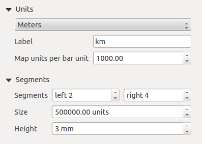
Mostrar
The Display dialog of the scale bar Item Properties tab provide the following functionalities (see figure_composer_scalebar_4):
Figure Composer Scalebar 4:
You can define how the scale bar will be displayed in its frame.
- Box margin : space between text and frame borders
- Labels margin : space between text and scale bar drawing
- Line width : line widht of the scale bar drawing
- Join style : Corners at the end of scalebar in style Bevel, Rounded or Square
(only available for Scale bar style Single Box & Double Box)
- Cap style : End of all lines in style Square, Round or Flat
(only available for Scale bar style Line Ticks Up, Down and Middle)
- Alignment : Puts text on the left, middle or right side of the frame
(works only for Scale bar style Numeric)
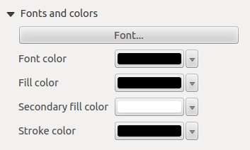
Fuentes y colores
The Fonts and colors dialog of the scale bar Item Properties tab
provide the following functionalities (see figure_composer_scalebar_5):
Figure Composer Scalebar 5:
You can define the fonts and colors used for the scale bar.
- Use the [Font] button to set the font
- Font color: set the font color
- Fill color: set the first fill color
- Secondary fill color: set the second fill color
- Stroke color: set the color of the lines of the Scale Bare
Fill colors are only used for scale box styles Single Box and Double Box.
To select a color you can use the list option using the dropdown arrow to open
a simple color selection option or the more advanced color selection option, that is
started when you click in the colored box in the dialog.
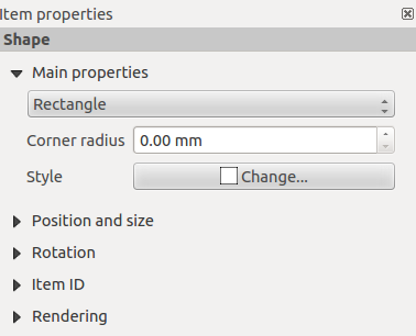
El elemento de forma básica
To add a basic shape (ellipse, rectangle, triangle), click the  Add basic shape icon
or the
Add basic shape icon
or the  Add Arrow icon, place the element holding down the left mouse. Customize the
appearance in the Item Properties tab.
Add Arrow icon, place the element holding down the left mouse. Customize the
appearance in the Item Properties tab.
When you also hold down the Shift key while placing the basic shape you can create a perfect square,
circle or triangle.
Figure Composer Basic Shape:
The Shape item properties tab allows you to select if you want to draw an ellipse,
rectangle or triangle inside the given frame.
You can set the style of the shape using the advanced symbol style dialog with which you can
define its outline and fill color, fill pattern, use markers etcetera.
For the rectangle shape, you can set the value of the corner radius to round of the corners.
Nota
Unlike other items, you can not style the frame or the background color of the frame.
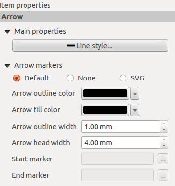
El elemento flecha
To add an arrow, click the Add Arrow icon, place the element holding
down the left mouse button and drag a line to draw the arrow on the Print Composer canvas and
position and customize the appearance in the scale bar Item Properties tab.
When you also hold down the Shift key while placing the arrow, it is placed in an angle
of exactly 45° .
The arrow item can be used to add a line or a simple arrow that can be used, for example, to
show the relation between other print composer items. To create a north arrow, the image item should
be considered first. QGIS has a set of North arrows in SVG format. Furthermore you can connect
an image item with a map so it can rotate automatically with the map (see the_image_item).
Figure Composer Arrow:
Propiedades del elemento
The Arrow item properties tab allows you to configure an arrow item.
The [Line style ...] button can be used to set the line style using the line style symbol editor.
In Arrows markers you can select one of three radio buttons.
- Default : To draw a regular arrow, gives you options to style the arrow head
- None : To draw a line without arrow head
- SVG Marker : To draw a line with an SVG Start marker and/or End marker
For Default Arrow marker you can use following options to style the arrow head.
- Arrow outline color : Set the outline color of the arrow head
- Arrow fill color : Set the fill color of the arrow head
- Arrow outline width : Set the outline width of the arrow head
- Arrow head width: Set the size of the arrow head
For SVG Marker you can use following options.
- Start marker : Choose an SVG image to draw at the beginning of the line
- End marker : Choose an SVG image to draw at the end of the line
- Arrow head width: Sets the size of Start and/or headmarker
SVG images are automatically rotated with the line. The color of the SVG image can not be changed.
El elemento de Tabla de Atributos
It is possible to add parts of a vector attribute table to the Print Composer
canvas: Click the  Add attribute table icon, place the
element with the left mouse button on the Print Composer canvas, and position and
customize the appearance in the Item Properties tab.
Add attribute table icon, place the
element with the left mouse button on the Print Composer canvas, and position and
customize the appearance in the Item Properties tab.
The Item properties of an attribute table item tab provides the following
functionalities (see figure_composer_table_1):
Figure Composer Attribute Table 1:
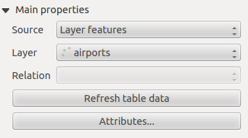
Propiedades principales
The Main properties dialogs of the attribute table Item Properties
tab provide the following functionalities (see figure_composer_table_2):
Figure Composer Attribute Table 2:
For Source you can normally select only ‘Layer features’.
With Layer you can choose from the vector layers loaded in the project.
The button [Refresh table data] can be used to refresh the table when the actual
contents of the table has changed.
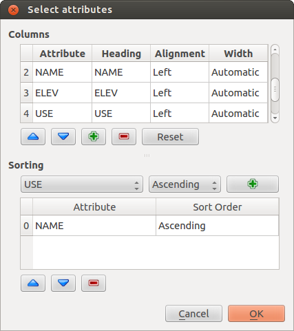
The button [Attributes...] starts the Select attributes menu, see
figure_composer_table_3, that can be used to change the visible contents of the table.
After making changes use the [OK] button to apply changes to the table.
En la sección Columnas se puede:
- Remove an attribute, just select an attribute row by clicking anywhere in a row and press
the minus button to remove the selected attribute.
- Add a new attribute use the plus button. At the end a new empty row appears and you can
select empty cell of the column Attribute. You can select a field attribute from
the list or you can select to build a new attribute using a regular expression.
- Use the up and down arrows to change the order of the attributes in the table.
- Select a cel in the Headings column to change the Heading, just type a new name.
- Select a cel in the Alignment column and you can choose between Left, Center or Right alignment.
- Select a cel in the Width column and you can change it from Automatic to a width in mm, just
type a number. When you want to change it back to Automatic, use the cross.
- The [Reset] button can allways be used to restore it to the original attribute settings.
En la sección Ordenar se puede:
- Add an attribute to sort the table with. Select an attribute and set the sorting order to ‘Ascending’
or ‘Descending’ and press the plus button. A new line is added to the sort order list.
- select a row in the list and use the up and down button to change the sort priority on attribute level.
- use the minus button to remove an attribute from the sort order list.
Figure Composer Attribute Table 3:
Feature filtering
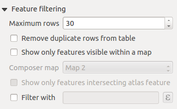
The Feature filtering dialogs of the attribute table Item Properties
tab provide the following functionalities (see figure_composer_table_4):
Figure Composer Attribute Table 4:
Puede:
Define the Maximum rows to be displayed.
Activate Remove duplicate rows from table to show unique records only.
Activate Show only visible features within a map and select the
corresponding Composer map to display the attributes of features only visible
on selected map.
Activate Show only features intersecting Atlas feature is only
available when Generate an atlas is activated. When activated it will
show a table with only the features shown on the map of that particular page of the atlas.
Activate Filter with and provide a filter by typing in the input
line or insert a regular expressing use the given expression button. A few examples of
filtering statements you can use when you have loaded the airports layer from the Sample
dataset:
- ELEV > 500
- NAME = 'ANIAK'
- NAME NOT LIKE 'AN%
- regexp_match( attribute( $currentfeature, 'USE' ) , '[i]')
The last regular expression will include only the arpoirts that have a letter ‘i’
in the attribute field ‘USE’.
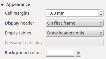
Apariencia
The Appearance dialogs of the attribute table Item Properties
tab provide the following functionalities (see figure_composer_table_5):
Figure Composer Attribute Table 5:
- With Cell margins you can define the margin around text in each cell
of the table.
- With Display header you can select from a list one of ‘On first frame’,
‘On all frames’ default option, or ‘No header’.
- The option Empty table controls what will be displayed when the result
selection is empty.
- Draw headers only, will only draw the header except if you have choosen ‘No header’
for Display header.
- Hide entire table, will only draw the background of the table. You can activate
Don’t draw background if frame is empty in Frames
to completely hide the table.
- Draw empty cells, will fill the attribute table with empty cells, this option can
also be used to provide additional empty cells when you have a result to show!
- Show set message, will draw the header and adds a cell spanning all columns and
display a message like ‘No result’ that can be provided in the option
Message to display
- The option Message to display is only activated when you have selected
Show set message for Empty table. The message provided will be shown
in the table in the first row, when the result is an empty table.
- With Background color you can set the background color of the table.
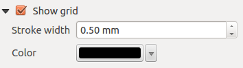
Mostrar cuadrícula
The Show grid dialog of the attribute table Item Properties tab
provide the following functionalities (see figure_composer_table_6):
Figure Composer Attribute Table 6:
- Activate Show grid when you want to display the grid, the outlines
of the table cells.
- With Stroke width you can set the thickness of the lines used in the grid.
- The Color of the grid can be set using the color selection dialog.
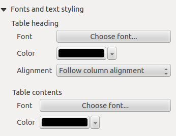
Fuente y estilo de texto
The Fonts and text styling dialog of the attribute table
Item Properties tab provide the following functionalities (see
figure_composer_table_7):
Figure Composer Attribute Table 7:
- You can define Font and Color for Table heading
and Table contents.
- For Table heading you can additionally set the Alignment and
choose from Follow column alignment, Left, Center or Right. The column
alignment is set using the Select Attributes dialog (see Figure_composer_table_3 ).
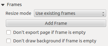
Frames
The Frames dialog of the attribute table Item Properties tab
provide the following functionalities (see figure_composer_table_8):
Figure Composer Attribute Table 8:
- With Resize mode you can select how to render the attribute table contents:
- Use existing frames displays the result in the first frame and added frames only.
- Extent to next page will create as many frames (and corresponding pages) as
necessary to display the full selection of attribute table. Each frame can be moved
around on the layout. If you resize a frame, the resulting table will be divided up
between the other frames. The last frame will be trimmed to fit the table.
- Repeat until finished will also create as many frames as the
Extend to next page option, except all frames will have the same size.
- Use the [Add Frame] button to add another frame with the same size as selected
frame. The result of the table that will not fit in the first frame will continue
in the next frame when you use the Resize mode Use existing frames.
- Activate Don’t export page if frame is empty prevents the page
to be exported when the table frame has no contents. This means all other composer items,
maps, scalebars, legends etc. will not be visible in the result.
- Activate Don’t draw background if frame is empty prevents the
background to be drawn when the table frame has no contents.
El elemento del marco HTML
It is possible to add a frame that displays the contents of a website or even create and style
your own HTML page and display it!
Click the  Add HTML frame icon, place the element by dragging a
rectangle holding down the left mouse button on the Print Composer canvas and position
and customize the appearance in the Item Properties tab
(see figure_composer_html_1).
Add HTML frame icon, place the element by dragging a
rectangle holding down the left mouse button on the Print Composer canvas and position
and customize the appearance in the Item Properties tab
(see figure_composer_html_1).
Figure Composer HTML 1:
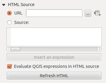
Fuente HTML
As an HTML source, you can either set a URL and activate the URL radiobutton or
enter the HTML source directly in the textbox provided and activate the Source radiobutton.
The HTML Source dialog of the HTML frame Item Properties tab
provides the following functionalities (see figure_composer_html_2):
Figure Composer HTML 2:
- In URL you can enter the URL of a webpage you copied from your internet
browser or select an HTML file using the browse button . There is also the
option to use the Data defined override button, to provide an URL from the contents of an
attribute field of a table or using a regular expression.
- In Source you can enter text in the textbox with some HTML tags or provide a full
HTML page.
- The [insert an expression] button can be used to insert an expression like
[%Year($now)%] in the Source textbox to display the current year. This button is only
activated when radiobutton Source is selected. After inserting the expression
click somewhere in the textbox before refreshing the HTML frame, otherwise you will
lose the expression.
- Activate Evaluate QGIS expressions in HTML code to see the result of
the expression you have included, otherwise you will see the expression instead.
- Use the [Refresh HTML] button to refresh the HTML frame(s) to see the result of
changes.
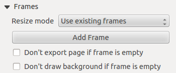
Frames
The Frames dialog of the HTML frame Item Properties tab
provides the following functionalities (see figure_composer_html_3):
Figure Composer HTML 3:
- With Resize mode you can select how to render the HTML contents:
- Use existing frames displays the result in the first frame and added frames only.
- Extent to next page will create as many frames (and corresponding pages) as
necessary to render the height of the web page. Each frame can be moved around on
the layout. If you resize a frame, the webpage will be divided up between the
other frames. The last frame will be trimmed to fit the web page.
- Repeat on every page will repeat the upper left of the web page on every page
in frames of the same size.
- Repeat until finished will also create as many frames as the
Extend to next page option, except all frames will have the same size.
- Use the [Add Frame] button to add another frame with the same size as selected
frame. If the HTML page that will not fit in the first frame it will continue
in the next frame when you use Resize mode or Use
existing frames.
- Activate Don’t export page if frame is empty prevents
the map layout from being exported when the frame has no HTML contents. This
means all other composer items,
maps, scalebars, legends etc. will not be visible in the result.
- Activate Don’t draw background if frame is empty
prevents the HTML frame being drawn if the frame is empty.
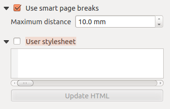
Use smart page breaks and User style sheet
The Use smart page breaks dialog and Use style sheet dialog of
the HTML frame Item Properties tab provides the following functionalities
(see figure_composer_html_4):
Figure Composer HTML 4:
Activate Use smart page breaks to prevent the html frame contents
from breaking mid-way a line of text so it continues nice and smooth in the next frame.
Set the Maximum distance allowed when calculating where to place page
breaks in the html. This distance is the maximum amount of empty space allowed at the
bottom of a frame after calculating the optimum break location. Setting a larger value
will result in better choice of page break location, but more wasted space at the bottom
of frames. This is only used when Use smart page breaks is activated.
Activate User stylesheet to apply HTML styles that often is provided
in cascading style sheets. An example of style code is provide below to set the color of
<h1> header tag to green and set the font and fontsize of text included in paragraph
tags <p>.
h1 {color: #00ff00;
}
p {font-family: "Times New Roman", Times, serif;
   font-size: 20px;
}
Use the [Update HTML] button to see the result of the stylesheet settings.
Administrar elementos
Tamaño y posición
Each item inside the Composer can be moved/resized to create a perfect layout.
For both operations the first step is to activate the Select/Move item
tool and to click on the item; you can then move it using the mouse while holding the left button.
If you need to constrain the movements to the horizontal or the vertical axis, just hold
the Shift while moving the mouse.
If you need a better precision, you can move a selected item using the Arrow keys on the keyboard;
if the movement is too slow, you can speed up it by holding Shift.
A selected item will show squares on its boundaries; moving one of them with the mouse, will resize the item in the corresponding direction. While resizing,
holding Shift will maintain the aspect ratio. Holding Alt will
resize from the item center.
The correct position for an item can be obtained using snapping to grid or
smart guides. Guides are set by clicking and dragging in the rulers. Guide are
moved by clicking in the ruler, level with the guide and dragging to a new
place. To delete a guide move it off the canvas. If you need to disable the
snap on the fly just hold Ctrl while moving the mouse.
You can choose multiple items with the Select/Move item button.
Just hold the Shift button and click on all the items you need. You can then resize/move
this group just like a single item.
Once you have found the correct position for an item, you can lock it by using
the items on the toolbar or ticking the box next to the item in the
tab. Locked items are not selectable on the canvas.
Locked items can be unlocked by selecting the item in the
tab and unchecking the tickbox or you can use the icons
on the toolbar.
To unselect an item, just click on it holding the Shift button.
Inside the menu, you can find actions to select all the items, to clear all selections or
to invert the current selection.
Alineación
Raising or lowering functionalities for elements are inside the  Raise selected items pull-down menu. Choose an element on the Print Composer
canvas and select the matching functionality to raise or lower the selected
element compared to the other elements (see table_composer_1). This order is
shown in the tab. You can also raise or lower objects
in the tab by clicking and dragging an object’s label
in this list.
Raise selected items pull-down menu. Choose an element on the Print Composer
canvas and select the matching functionality to raise or lower the selected
element compared to the other elements (see table_composer_1). This order is
shown in the tab. You can also raise or lower objects
in the tab by clicking and dragging an object’s label
in this list.
Figure Composer 28:
There are several alignment functionalities available within the  Align selected items pull-down menu (see table_composer_1). To use an
alignment functionality, you first select some elements and then click on the
matching alignment icon. All selected elements will then be aligned within to their common
bounding box.
When moving items on the Composer canvas, alignment helper lines appear when borders, centers or corners are aligned.
Align selected items pull-down menu (see table_composer_1). To use an
alignment functionality, you first select some elements and then click on the
matching alignment icon. All selected elements will then be aligned within to their common
bounding box.
When moving items on the Composer canvas, alignment helper lines appear when borders, centers or corners are aligned.
Elementos Copiar/Cortar y Pegar
The print composer includes actions to use the common Copy/Cut/Paste functionality for the items
in the layout. As usual first you need to select the items using one of the options seen above;
at this point the actions can be found in the menu. When using the Paste action, the elements
will be pasted according to the current mouse position.
Nota
HTML items can not be copied in this way. As a workaround, use the [Add Frame] button in the tab.
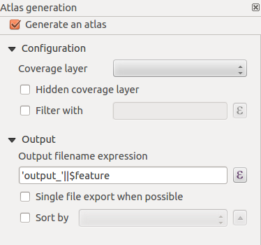
Generación de Atlas
The Print Composer includes generation functions that allow you to create map books
in an automated way. The concept is to use a coverage layer, which contains
geometries and fields. For each geometry in the coverage layer, a new output
will be generated where the content of some canvas maps will be moved to
highlight the current geometry. Fields associated with this geometry can be used
within text labels.
Every page will be generated with each feature. To enable the generation
of an atlas and access generation parameters, refer to the Atlas generation
tab. This tab contains the following widgets (see Figure_composer_atlas):
Figure Composer Atlas:
You can use multiple map items with the atlas generation; each map will be rendered according
to the coverage features. To enable atlas generation for a specific map item, you need to check
Controlled by Atlas under the item properties of the map item. Once checked, you can set:
- An input box Margin around feature that allows you to select the amount
of space added around each geometry within the allocated map. Its value is
meaningful only when using the auto-scaling mode.
- A Fixed scale that allows you to toggle between auto-scale
and fixed-scale mode. In fixed-scale mode, the map will only be translated for
each geometry to be centered. In auto-scale mode, the map’s extents are computed
in such a way that each geometry will appear in its entirety.
Etiquetas
In order to adapt labels to the feature the atlas plugin iterates over, you can include expressions.
For example, for a city layer with fields CITY_NAME and ZIPCODE, you could insert this:
The area of [% upper(CITY_NAME) || ',' || ZIPCODE || ' is ' format_number($area/1000000,2) %] km2
The information [% upper(CITY_NAME) || ‘,’ || ZIPCODE || ‘ is ‘ format_number($area/1000000,2) %]
is an expression used inside the label. That would result in the generated atlas as:
The area of PARIS,75001 is 1.94 km2
Data Defined Override Buttons
There are several places where you can use a Data Defined Override
button to override the selected setting. These options are particularly usefull with Atlas Generation.
For the following examples the Regions layer of the QGIS sample dataset is used and selected
for Atlas Generation.
We also assume the paper format A4 (210X297) is selected in the Composite tab
for field Presets.
With a Data Defined Override button you can dynamically set the paper orientation.
When the height (north-south) of the extents of a region is greater than it’s width (east-west), you
rather want to use portrait instead of landscape orientation to optimize the use of paper.
In the Composition you can set the field Orientation and select Landscape
or Portrait. We want to set the orientation dynamically using an expression depending on the region geometry.
press the button of field Orientation, select so
the Expression string builder dialog opens. Give following expression:
CASE WHEN bounds_width($atlasgeometry) > bounds_height($atlasgeometry) THEN 'Landscape' ELSE 'Portrait' END
Now the paper orients itself automatically for each Region you need to reposition the location
of the composer item as well. For the map item you can use the button of
field Width to set it dynamically using following expression:
(CASE WHEN bounds_width($atlasgeometry) > bounds_height($atlasgeometry) THEN 297 ELSE 210 END) - 20
Use the button of field Heigth to provide following expression:
(CASE WHEN bounds_width($atlasgeometry) > bounds_height($atlasgeometry) THEN 210 ELSE 297 END) - 20
When you want to give a title above map in the center of the page, insert a label item above the map.
First use the item properties of the label item to set the horizontal alignment to  Center.
Next activate from Reference point the upper middle checkbox.
You can provide following expression for field X :
Center.
Next activate from Reference point the upper middle checkbox.
You can provide following expression for field X :
(CASE WHEN bounds_width($atlasgeometry) > bounds_height($atlasgeometry) THEN 297 ELSE 210 END) / 2
For all other composer items you can set the position in a similar way so they are correctly positioned
when page is automatically rotated in portrait or landscape.
Information provided is derived from the excellent blog (in english and portugese)
on the Data Defined Override options Multiple_format_map_series_using_QGIS_2.6 .
This is just one example of how you can use Data Defined Overrides.
Vista previa
Once the atlas settings have been configured and map items selected, you can create a preview of all the pages by
clicking on and using the arrows, in the same menu, to navigate
through all the features.
Generación
The atlas generation can be done in different ways. For example, with , you can directly print it. You can also create a PDF using : The user will be asked for a directory for saving all the generated PDF files (except if the Single file export when possible has been selected).
If you need to print just a page of the atlas, simply start the preview function, select the page you need and click on (or create a PDF).
Crear salida
Figure_composer_output shows the Print Composer with an example print layout,
including each type of map item described in the sections above.
Figure Composer Output:
The Print Composer allows you to create several output formats, and it is possible
to define the resolution (print quality) and paper size:
- The
 Print icon allows you to print the layout to a
connected printer or a PostScript file, depending on installed printer drivers.
Print icon allows you to print the layout to a
connected printer or a PostScript file, depending on installed printer drivers.
- The
 Export as image icon exports the Composer
canvas in several image formats, such as PNG, BPM, TIF, JPG,...
Export as image icon exports the Composer
canvas in several image formats, such as PNG, BPM, TIF, JPG,...
 Export as PDF saves the defined Print Composer
canvas directly as a PDF.
Export as PDF saves the defined Print Composer
canvas directly as a PDF.- The
 Export as SVG icon saves the Print Composer canvas
as an SVG (Scalable Vector Graphic).
Export as SVG icon saves the Print Composer canvas
as an SVG (Scalable Vector Graphic).
If you need to export your layout as a georeferenced image (i.e., to load back
inside QGIS), you need to enable this feature under the Composition tab. Check
World file on and choose the map item to use. With this option, the
‘Export as image’ action will also create a world file.
Nota
- Currently, the SVG output is very basic. This is not a QGIS problem, but a
problem with the underlying Qt library. This will hopefully be sorted out
in future versions.
- Exporting big rasters can sometimes fail, even if there seems to be
enough memory. This is also a problem with the underlying Qt management
of rasters.
Administrar el diseñador de impresión
With the  Save as template and
  Add items from template icons, you can save the current state of a Print Composer
session as a .qpt template and load the template again in another session.
Add items from template icons, you can save the current state of a Print Composer
session as a .qpt template and load the template again in another session.
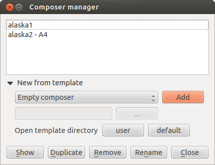
The  Composer Manager button in the QGIS toolbar
and in allows you to add a new Composer
template, create a new composition based on a previously saved template or to manage
already existing templates.
Composer Manager button in the QGIS toolbar
and in allows you to add a new Composer
template, create a new composition based on a previously saved template or to manage
already existing templates.
Figure Composer Manager:
By default, the Composer manager searches for user templates in ~/.qgis2/composer_template.
The New Composer and  Duplicate Composer
buttons in the QGIS toolbar and in and
allow you to open a new Composer dialog, or to
duplicate an existing composition from a previously created one.
Duplicate Composer
buttons in the QGIS toolbar and in and
allow you to open a new Composer dialog, or to
duplicate an existing composition from a previously created one.
Finally, you can save your print composition with the Save Project button.
This is the same feature as in the QGIS main window. All changes will be saved in a QGIS project
file.


 : Puede hacer que el elemento subyacente en el diseñador visible con esta herramienta. Utilice el control deslizante para adaptar la visibilidad de su elemento a sus necesidades. También puede hacer una definición precisa del porcentaje de visibilidad en el menú al lado de la barra de desplazamiento.
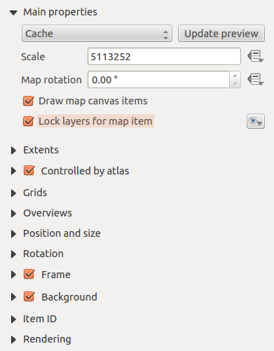

 establece una escala manual
 le permite añadir más rápido las vistas predeterminadas que ha preparado en QGIS. Al Hacer clic en el botón
  . Vea Leyenda del mapa para averiguar cómo crear vistas preestablecidas.
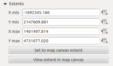