.
Compositor de Impressão
O compositor de impressão fornece grandes recursos de layout e impressão. Permite que possa adicionar elementos como o enquadramento do mapa QGIS, etiquetas de texto, imagens, legendas, barras de escala, formas básicas, setas, tabelas de atributo e molduras HTML. Pode dimensionar, agrupar, alinhar, e posicionar cada elemento e ajustar as propriedades para criar o seu layout. O layout pode ser impresso ou exportado para formatos de imagens, Postscript, PDF ou para SVG (a exportação para SVG não está a trabalhar correctamente com algumas versões recentes do Qt4, deve experimentar e verificar o seu sistema individualmente). Pode guardar o layout como modelo e carregá-lo outra vez noutra sessão. Finalmente, vários mapas baseados num modelo podem ser gerados através do Gerador de Atlas. Veja a lista de ferramentas no table_composer_1:
Ícone
|
Finalidade
|
Ícone
|
Finalidade
|
|---|
| |
|
|
|
 |
Guardar Projecto
|
 |
Novo Compositor
|
 |
Duplicar Compositor
|
 |
Gestor de Compositores
|
 |
Carregar a partir do modelo
|
 |
Guardar como modelo
|
 |
Imprimir ou exportar como PostScript
|
 |
Exportar como imagem
|
 |
Exportar como SVG
|
 |
Exportar como PDF
|
 |
Reverter à última alteração
|
 |
Restaurar a última alteração
|
 |
Zoom Total
|
 |
Visualizar a 100%
|
 |
Aproximar
|
|
Afastar
|
 |
Actualizar vista
|
|
|
 |
Movimentar
|
 |
Zoom a uma área especifica
|
 |
Seleccionar/ Mover item
|
 |
Mover conteúdo do item
|
 |
Adicionar novo mapa do QGIS no enquadramento do mapa
|
 |
Adicionar imagem
|
 |
Adicionar nova etiqueta
|
 |
Adicionar nova legenda
|
 |
Adicionar barra de escala ao compositor de impressão
|
 |
Adicionar forma básica
|
 |
Adicionar seta
|
 |
Adicionar tabela de atributos
|
 |
Adicionar uma HTML Frame
|
|
|
 |
Agrupar itens
|
 |
Desagrupar itens
|
| |
Bloquear itens seleccionados
|
|
Desbloquear todos os itens
|
 |
Elevar itens seleccionados
|
 |
Abaixar itens seleccionados
|
 |
Trazer para a frente
|
 |
Enviar para trás
|
 |
Alinhar à esquerda
|
 |
Alinhar à direita
|
 |
Alinhar ao centro
|
 |
Centraliza na vertical
|
 |
Alinhar ao topo
|
 |
Alinhar ao fundo
|
 |
Pré-Visualizar Atlas
|
 |
Primeiro Elemento
|
 |
Elemento Anterior
|
 |
Próximo Elemento
|
 |
Último Elemento
|
|
Imprimir Atlas
|
|
Exportar Atlas como Imagem
|
 |
Atlas Configurações
|
Tabela 1 do Compositor: Ferramentas do Compositor de Impressão
Todas as ferramentas do Compositor de Impressão estão disponíveis nos menus e como ícones na barra de ferramentas. A barra de ferramentas pode ser desligada ou ligada usando o botão direito do rato sobre a barra de ferramentas.
Primeiros passos
Abrir um novo Modelo de de Compositor de Impressão
Antes de começar a trabalhar com o compositor de impressão, necessita de carregar algumas camadas vectoriais e matriciais no enquadramento do mapa QGIS e adaptar as suas propriedades para se ajustar à sua conveniência. Após tudo estar renderizado ou simbolizado ao seu gosto, clique no ícone Novo Compositor de Impressão na barra de ferramentas ou escolha . Será-lhe pedido para escolher um título para o novo compositor.
Using Print Composer
Opening the Print Composer provides you with a blank canvas to which you can add
the current QGIS map canvas, text labels, images, legends, scale bars, basic
shapes, arrows, attribute tables and HTML frames. Figure_composer_1 shows the
initial view of the Print Composer before any elements are added.
Figure Composer 1:
The Print Composer provides four tabs:
No fundo da janela do Compositor de Impressão, pode encontrar a barra de estado com a posição do rato, o número da página actual e uma combo box para definir o nível de zoom.
Pode adicionar múltiplos elementos no compositor. É também possível ter mais do que uma vista de mapa ou legenda ou escala gráfica no enquadramento do compositor de impressão, numa ou em várias páginas. Cada elemento tem as suas próprias propriedades e no caso do mapa, a sua própria extensão. Se quiser remover alguma elemento do enquadramento do compositor pode-o fazer usando a tecla Delete ou Backspace.
Opções do Compositor de Impressão
A partir das pode definir algumas opções que serão usadas como padrão durante o seu trabalho.
As Configurações padrão das Composições deixam-mo especificar a fonte padrão a usar.
Com o Aparência da Grelha, pode definir o estilo da grelha e a sua cor.
A Grelha padrão define espaçamento, afastamento e tolerância da grelha. Existem três tipos de grelha: Pontos, Sólida linhas e Cruzes.
As Guias padrão definem a tolerância para as guias.
Separador de Composição — Configuração geral da composição
No separador Composição, pode definir as configurações globais à sua composição.
Pode escolher uma das Predefinições para o seu formato de papel, ou introduza a sua largura e altura personalizada.
A composição pode ser agora separada em várias páginas. Por exemplo, a primeira página pode mostrar o enquadramento do mapa e a segunda página irá mostrar a tabela de atributos associada à camada enquanto a terceira apenas mostra uma moldura HTML ligado ao sítio da internet da sua organização. Configure o Número de páginas que deseja. Pode escolher a página Orientação e a sua Resolução exportada. Quando activa a opção  imprimir como raster indica que todos os elementos serão rasterizados antes de ser imprimidos ou guardados como PostScript ou PDF.
A Grelha permite que possa personalizar as configurações da grelha como espaçamentos, afastamentos e tolerância às suas necessidades.
Na Tolerância aos alinhamentos, pode alterar a Tolerância, que é a máxima distância abaixo que cada item é atraído às guias inteligentes.
A atracção à grelha e/ou às guias inteligentes podem ser activadas a partir do menu . Neste menu, pode também esconder ou mostrar a grelha e as guias inteligentes.
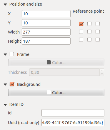
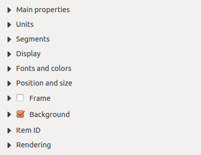
Composer items general options
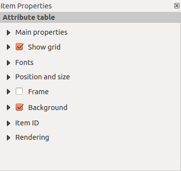
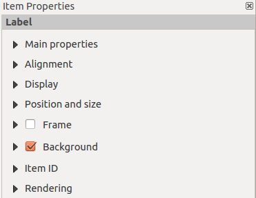
Composer items have a set of common properties you will find on the bottom of the Item Properties tab: Position and size, Frame,
Background, Item ID and Rendering (See figure_composer_2).
Figure Composer 2:
A janela Posição e tamanho permite que defina o tamanho e posição da moldura que contém o item. Pode também escolher que Ponto de referência será configurado nas coordenadas X e Y previamente definidas.
A :guilabel:otação`define a rotação do elemento (em graus).
A Moldura mostra ou esconde a moldura à volta da etiqueta. Clique nos botões de [Cor] e [Espessura] para ajustar essas propriedades.
O Fundo activa ou desactiva a cor do fundo. Clique no botão [Cor...] para exibir a janela onde vai escolher uma cor pré-definida ou escolher uma cor personalizada. A Transparência pode também ser ajustada no campo alfa.
Use o Item ID para criar uma relação para outro item do Compositor de Impressão. Isto é usado com o QGIS server e em qualquer web client potencial. Pode definir um ID num item (ex.:, um mapa e um rótulo), e de seguida o web client pode enviar dados para definir a propriedade (ex.: texto do rótulo) para esse item específico. O comando GetProjectSettings irá listar que itens e que IDs estão disponíveis no layout.
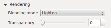
o modo Renderização pode ser seleccionado no campo opção. Veja Rendering_Mode .
Modo de Renderização
O QGIS permite agora renderização avançada para os itens do Compositor como para as camadas vectoriais e rasters.
Figure Composer 3:
Transparência 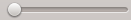 : pode sublinhar o item no compositor visível com esta ferramenta. Use a barra de deslizamento para adaptar a visibilidade do seu item à sua necessidade. Pode também definir com precisão a percentagem de visibilidade no menu ao lado da barra de deslizamento.
Modo de mistura: pode alcançar efeitos especiais de renderização com estas ferramentas que anteriormente só era conhecido de programas gráficos. Os pixeis dos itens sobrejacente e subjacente são misturados através das configurações descritas em baixo.
Normal: Este é o modo padrão de renderização que usa o canal alfa do pixel superior para renderizar com o pixel abaixo dele; as cores não estão misturadas.
Mais claro: Selecciona o máximo de cada componente dos pixeis de primeiro plano e de fundo. Tenha atenção que os resultados tendem a ser irregulares e “áspero”.
Ecrã: Os pixeis claros da fonte são pintados sobre o destino e os pixeis escuros não são. Este modo é muito útil pata misturar texturas de uma camada com outra camada. (Ex.: pode usar o mapa de sombras como textura noutra camada).
Subexposição: A subexposição irá clarear e saturar os pixeis subjacentes baseados na luminosidade do pixel superior. A maior claridade do pixel superior causa o aumento da saturação e brilho dos pixeis subjacentes. Isto funciona melhor nos pixeis superiores que não brilham muito, caso contrário o efeito é muito extremo.
Adição: Este modo de renderização simplesmente adiciona os valores dos pixeis de uma camada noutra. Nos casos que os valores são acima de 1 (como no caso do RGB), o branco é exibido. Este modo é adequado para destacar elementos.
Escurecido: Cria um pixel resultante que retêm os componentes mais pequenos dos pixeis do primeiro plano e do fundo. Como o mais claro, o resulto tende a ser irregular e “áspero”.
Multiplicar: Aqui, os números de cada pixel superior da camada multiplica com o pixel correspondente da camada abaixo. Os resultados são imagens mais escuras.
Queimar: As cores escuras da camada superior torna mais escuro as camadas subjacentes. Pode ser usado para ajustar e colorizar camadas subjacentes.
Sobreposição: É uma combinação entre os modos de renderização de multiplicar e ecrã. Como resultado as partes claras da imagem tornam-se mais claras e as partes escuras ficam mais escuras.
Pouca luz: Muito semelhante à sobreposição, mas em vez de usar multiplicar/ecrã usa o queimar/subexposição. Neste modo é suposto imitar brilhar uma luz suave numa imagem.
Muita luz: Este modo é muito semelhante ao modo de sobreposição. É suposto simular a projecção de uma luz muito intensa numa imagem.
Diferença: A diferença subtrair o pixel superior com pixel de baixo e vice-versa, para obter sempre o valor positivo. A mistura com pretos não produz alteração, como valor todas as cores são zero.
Subtracção: Este modo de renderização simplesmente subtrair os valores do pixel de uma camada à outra. Em caso de valores negativos, o preto é exibido.
Itens do Compositor
Adding a current QGIS map canvas to the Print Composer
Clique no botão da barra de ferramentas Adicionar novo mapa do compositor de impressão para adicionar ao enquadramento do mapa QGIS. Agora arraste um rectângulo para o enquadramento do compositor com o botão esquerdo do rato para adicionar o mapa. Para exibir o mapa actual, pode escolher entre três modos diferentes no separador do mapa Propriedades do Item Properties:
Rectângulo é a configuração padrão. Apenas exibe uma caixa vazia com a mensagem ‘O mapa será impresso aqui’.
Cache renderiza um mapa para a resolução actual do ecrã. Se quiser aproximar ou afastar na janela do Compositor, o mapa não irá renderizar mas a imagem é redimensionada.
Desenhar significa, que se aproximar ou afastar na janela do compositor, o mapa será novamente renderizada, mas por razões de espaço, apenas para a resolução máxima.
Cache é o modo de pré-visualização padrão para novos mapas adicionados no Compositor de Impressão.
Pode redimensionar o elemento mapa clicando no botão  Seleccionar/Mover item, seleccionado o elemento, e arrastando um dos manipuladores azuis do canto do mapa. Com o mapa seleccionado, pode agora adaptar mais propriedades no mapa no separador Propriedades do Item
To move layers within the map element, select the map element, click the
Move item content icon and move the layers within
the map element frame with the left mouse button. After you have found the right place
for an element, you can lock the element position within the Print Composer
canvas. Select the map element and click on the right mouse button to  Lock the element position and again to unlock the element. You can also lock
the map element by activating the Lock layers for map
item checkbox in the Map dialog of the Item Properties
tab.
Lock the element position and again to unlock the element. You can also lock
the map element by activating the Lock layers for map
item checkbox in the Map dialog of the Item Properties
tab.
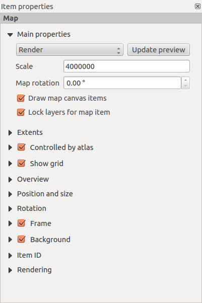
Propriedades principais
The Main properties dialog of the map Item Properies tab provides the
following functionalities (see figure_composer_4):
Figure Composer 4:
A área de Pré-visualização permite que defina modos de pré-visualização ‘Rectângulo’, ‘Cache’ e ‘Desenhar’, como é descrito em cima. Se mudar a vista do enquadramento do mapa QGIS ampliando ou movendo ou alterando o vector ou alterando as propriedades do raster, pode actualizar a vista do Compositor de Impressão seleccionando o elemento mapa no Compositor de Impressão e clicando no botão [Actualizar pré-visualização].
O campo Escala  define a escala manual.
O campo Rotação permite rodar o conteúdo do elemento mapa no sentido do ponteiro dos relógios em graus. Atenção, a moldura de coordenadas apenas pode ser adicionada com o valor padrão igual a 0.
O Desenhar itens de mapa permite exibir anotações que podem ser posicionados no enquadramento do mapa na janela principal do QGIS.
- You can choose to lock the layers shown on a map item. Check Lock layers for map item. After this is checked, any layer that would be
displayed or hidden in the main QGIS window won’t appear or be hidden in the map item of the Composer. But style and
labels of a locked layer are still refreshed according to the main QGIS interface.
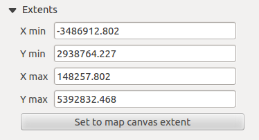
Extensões
The Extents dialog of the map item tab provides the following
functionalities (see figure_composer_5):
Figure Composer 5:
- The Map extent area allows you to specify the map extent using Y and X min/max
values or by clicking the [Set to map canvas extent] button.
If you change the view on the QGIS map canvas by changing
vector or raster properties, you can update the Print Composer view by selecting
the map element in the Print Composer and clicking the [Update preview] button
in the map Item Properties tab (see figure_composer_2).
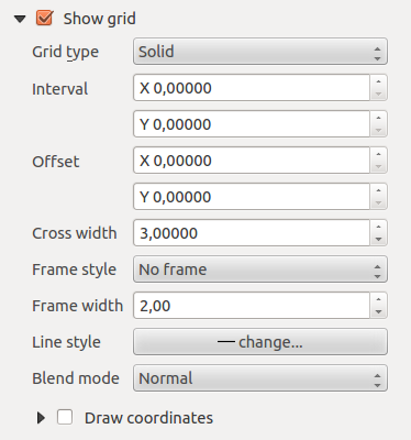
Grelha
The Grid dialog of the map Item Properties tab provides the
following functionalities (see Figure_composer_6):
Figure Composer 6:
- The Show grid checkbox allows you to overlay a grid onto the
map element. As grid type, you can specify to use a solid line or cross. Symbology of
the grid can be chosen. See section Rendering_Mode.
Furthermore, you can define an interval in the X and Y directions, an X and Y offset,
and the width used for the cross or line grid type.
- You can choose to paint the frame with a zebra style. If not selected, the general frame option is used (see section Frame_dialog).
Advanced rendering mode is also available for grids (see section Rendering_mode).
A caixa de verificação Desenhar coordenadas permite que adicione coordenadas à moldura do mapa. A anotação pode ser desenhada dentro ou fora da moldura do mapa. A direcção da anotação pode ser definida como horizontal, vertical, horizontal e vertical ou no sentido do limite, individualmente para cada moldura. As unidades podem ser em metros ou em graus. Finalmente pode definri a cor da grelha, o tipo de letra da anotação, a distância da anotação da moldura do mapa e a precisão das coordenadas desenhadas.
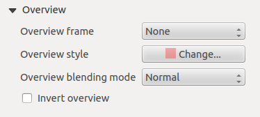
Overview
The Overview dialog of the map Item Properties tab provides the
following functionalities (see Figure_composer_7):
Figure Composer 7:
If the Composer has more than one map, you can choose to use a first map to show the extents of a second map.
The Overview dialog of the map Item Properties tab allows you to customize the appearance of that feature.
- The Overview frame combo list references the map item whose extents will be drawn on the present map item.
- The Overview Style allows you to change the frame color. See section vector_style_manager .
- The Overview Blend mode allows you to set different transparency blend modes, to enhance visibility of the frame. See Rendering_Mode.
- If checked, Invert overview creates a mask around the extents: the referenced map extents are shown clearly,
whereas everything else is blended with the frame color.
Adding a Label item to the Print Composer
Para adicionar uma etiqueta clique no ícone Adicionar nova etiqueta, posicione o elemento com o botão esquerdo do rato no enquadramento do compositor de impressão e personalize a aparência no separador da etiqueta Propriedades do Item.
The Item Properties tab of a label item provides the following functionalities:
Figure Composer 8:
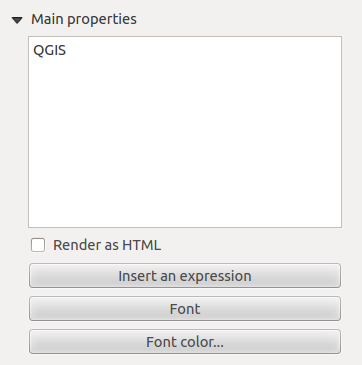
Propriedades principais
The Main properties dialog of the label Item Properties tab provides the
following functionalities (see Figure_composer_9):
Figure Composer 9:
A janela das propriedades principais é onde inserido o texto (HTML ou não) ou a expressão necessária para preencher a etiqueta adicionada ao enquadramento do compositor.
As etiquetas podem ser interpretadas como código HTML: activa a Renderizar como HTML. Pode agora inserir um URL, uma imagem com link que por sua vez irá ligar-se a uma página de internet ou outra coisa mais complexa.
- You can also insert an expression. Click on [Insert an expression] to open a new dialog. Build an expression by clicking the
functions available in the left side of the panel. On the right side of the Insert an expression dialog, the help file
associated with the function selected is displayed. Two special categories can be useful, particularly associated with the atlas functionality:
geometry functions and records functions. At the bottom, a preview of the expression is shown.
- Define font and font color by clicking on the [Font] and [Font color...] buttons.
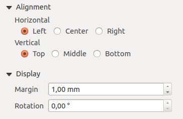
Alinhamentos e Exibição
The Alignment and Display dialogs of the label Item Properties tab provide the
following functionalities (see Figure_composer_10):
Figure Composer 10:
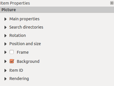
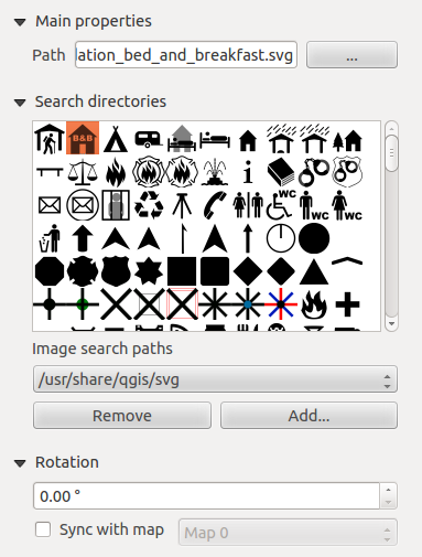
Adding an Image item to the Print Composer
Para adicionar uma imagem, clique no ícone Adicionar imagem, posicione o elemento com o botão esquerdo do rato no enquadramento do Compositor de Impressão e posicione e personalize a sua aparência no separador Propriedades Item da imagem.
The image Item Properties tab provides the following functionalities (see figure_composer_11):
Figure Composer 11:
Main properties, Search directories and Rotation
The Main properties and Search directories dialogs of the image Item Properties tab provide the
following functionalities (see Figure_composer_12):
Figure Composer 12:
- The Main properties dialog shows the current image that is displayed in the image item.
Click on the [...] button to select a file on your computer.
- This dialog shows all pictures stored in the selected directories.
- The Search directories area allows you to add and remove directories with
images in SVG format to the picture database.
- Images can be rotated with the Rotation field.
- Activating the Sync with
map checkbox synchronizes the rotation of a picture in the QGIS map canvas
(i.e., a rotated north arrow) with the appropriate Print Composer image.
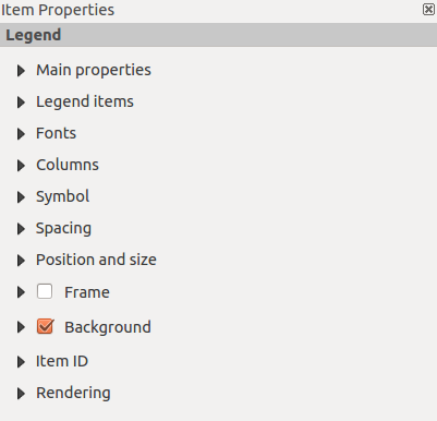
Adding a Legend item to the Print Composer
Para adicionar uma legenda de mapa, clique no ícone Adicionar nova legenda, posicione o elemento com o botão esquerdo do rato no enquadramento do compositor de impressão e posicione e personalize a sua aparência no separador da legenda Propriedades do Item.
The Item properties of a legend item tab provides the following
functionalities (see figure_composer_14):
Figure Composer 13:
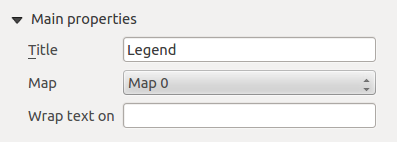
Propriedades principais
The Main properties dialog of the legend Item Properties tab
provides the following functionalities (see figure_composer_14):
Figure Composer 14:
- Here, you can adapt the legend title.
- You can also choose which Map item the current legend will refer to in the select list.
- Since QGIS 1.8, you can wrap the text of the legend title on a given character.
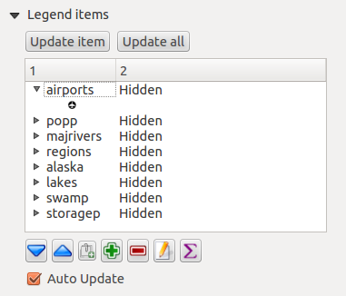
Itens Legenda
The Legend items dialog of the legend Item Properties tab
provides the following functionalities (see figure_composer_15):
Figure Composer 15:
- The legend items window lists all legend items and allows you to change item order,
group layers, remove and restore items in the list, and edit layer names. After changing the
symbology in the QGIS main window, you can click on [Update] to adapt the
changes in the legend element of the Print Composer. The item order can be
changed using the [Up] and [Down] buttons or with ‘drag-and-drop’
functionality.
- The feature count for each vector layer can be shown by enabling the [Sigma] button.
- The legend will be updated automatically if Auto-update is checked.
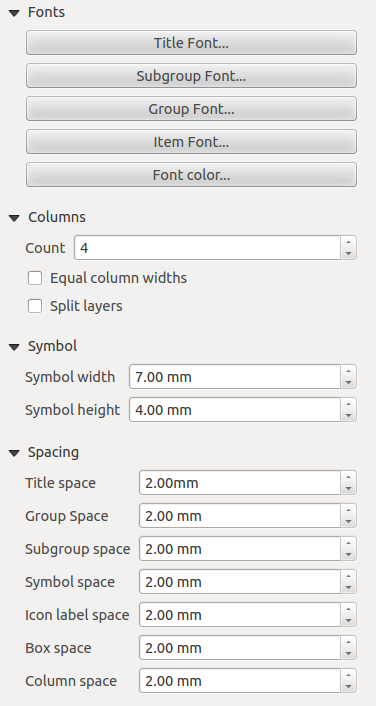
Fonts, Columns, Symbol and Spacing
The Fonts, Columns, Symbol and Spacing dialogs of the legend Item Properties tab
provide the following functionalities (see figure_composer_16):
Figure Composer 16:
Pode mudar a fonte do título, grupo, subgrupo, e item (camada) no item legenda. Clique no botão da categoria para abrir a janela de Seleccionar fonte.
- All these items will get the same Color.
- Legend items can be arranged in several columns. Select the correct value in the Count field.
A Largura igual de colunas define como as colunas da legenda devem ser ajustadas.
A opção Dividir camadas permite categorizar ou graduar a legenda da camada para ser dividida mediante as colunas.
Pode alterar a largura e altura para o símbolo da legenda nesta janela.
- Spacing aroung title, group, subgroup, symbol, icon label, box space or column space can be customized through this dialog.
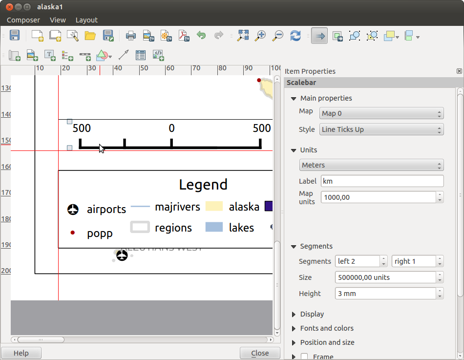
Adding a Scale Bar item to the Print Composer
Para adicionar uma barra de escala, clique no ícone Adicionar nova Escala Gráfica, posicione o elemento com o botão esquerdo do rato no enquadramento do Compositor de Impressão, posicione e personalize a sua aparência no separador da legenda Propriedades do Item.
The Item properties of a scale bar item tab provides the following
functionalities (see figure_composer_17):
Figure Composer 17:
Propriedades principais
The Main properties dialog of the scale bar Item Properties tab
provides the following functionalities (see figure_composer_18):
Figure Composer 18:
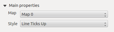
Primeiro, escolha o mapa a que a barra de escala será ligada.
De seguida, escolha o estilo da sua escala gráfica. Estão disponíveis seis estilos:
Os estilos Caixa simples e Caixa dupla que contêm uma ou duas linhas de caixas de cores alternadas.
Espessura de linhas do Meio, Acima ou Abaixo,
Numérica : o rácio de escala é imprimida (ex.: 1:50000).
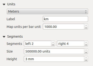
Unidades e Segmentos
The Units and Segments dialogs of the scale bar Item Properties tab
provide the following functionalities (see figure_composer_19):
Figure Composer 19:
Nestas duas janelas, pode configurar como a escala gráfica será representada.
- Select the map units used. There are three possible choices: Map Units is the automated unit
selection; Meters or Feet force unit conversions.
O campo Etiqueta define o texto usado para descrever a unidade da escala gráfica.
As Unidades de Mapa por unidades de escala permitem fixar uma proporção entre as unidades de mapa e a sua representação na escala gráfica.
Pode definir quantos Segmentos serão desenhados no lado esquerdo e direito da escala gráfica, e qual o tamanho terá cada segmento ( campo Tamanho). A Altura pode também ser definida.
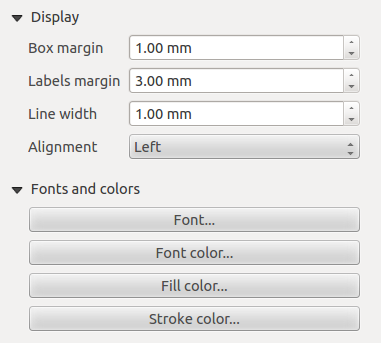
Display, Fonts and colors
The Display and Fonts and colors dialogs of the scale bar Item Properties tab provide the following functionalities (see figure_composer_20):
Figure Composer 20:
- You can define how the scale bar will be displayed in its frame. Adjust the Box margin between text and frame borders,
Labels margin between text and scale bar drawing and the Line width of the scale bar drawing.
- The Alignment in the Display dialog only applies to Numeric styled scale bars and puts text on the
left, middle or right side of the frame.
Adding a Basic shape or Arrow item to the Print Composer
It is possible to add basic shapes (ellipse, rectangle, triangle) and arrows
to the Print Composer canvas: Click the Add basic shape icon or the
Add Arrow icon, place the element with the left mouse button on the Print Composer canvas and position
and customize the appearance in the Item Properties tab.
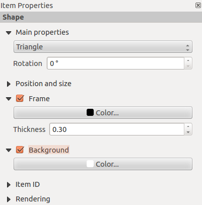
The Shape item properties tab allows you to draw an ellipse, rectangle, or triangle
in the Print Composer canvas. You can define its outline and fill color, the
outline width and a clockwise rotation. For the rectangle shape, you can change the value
of the corner radius.
Figure Composer 21:
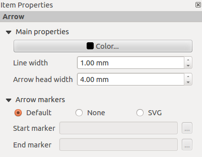
The Arrow item properties tab allows you to draw an arrow in the Print Composer canvas.
You can define color, outline and arrow width, and it is possible to use a default
marker, no marker, or an SVG marker. For the SVG marker, you can additionally
add an SVG start and end marker from a directory on your computer.
Figure Composer 22:
Propriedades principais
- For basic shapes, this dialog allows you to choose an Ellipse, Rectangle or Triangle shape and its rotation.
- Unlike the other items, line style, line color and background color of a basic shape are adjusted with the Frame and Background dialog.
No frame is drawn.
- For arrows, you can define here the line style: Color, Line width and Arrow head width.
- Arrows markers can be adjusted. If you want to set an SVG Start marker and/or End marker, browse to
your SVG file by clicking on the [...] button after selecting the SVG radio button.
Note
Unlike other items, the background color for a basic shape is the shape background and not the frame background.
Add attribute table values to the Print Composer
It is possible to add parts of a vector attribute table to the Print Composer
canvas: Click the Add attribute table icon, place the element with the left mouse button on the Print Composer
canvas, and position and customize the appearance in the Item Properties tab.
The Item properties of an attribute table item tab provides the following
functionalities (see figure_composer_23):
Figure Composer 23:
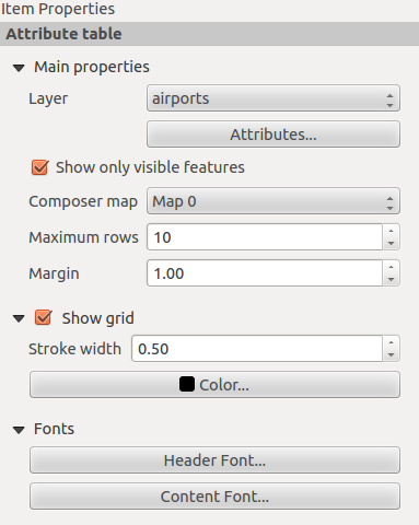
Main properties, Show grid and Fonts
The Main properties, Show grid and Fonts dialogs of the attribute table Item Properties tab
provide the following functionalities (see figure_composer_24):
Figure Composer 24:
Figure Composer 25:
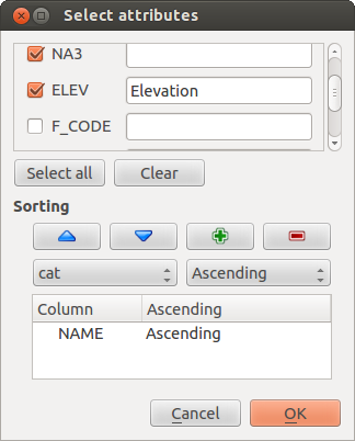
- The Table dialog allows you to select the vector layer and columns of the attribute table. Attribute columns can be sorted, and you
can specify whether to show values in ascending or descending order (see figure_composer_25).
- You can choose to display the attributes of only features visible on a map. Check Show only visible features and
select the corresponding Composer map to filter.
- You can define the Maximum number of rows to be displayed and the margin around text.
- Additionally, you can define the grid characteristics of the table (Stroke width and Color of the grid) and the
header and content font.
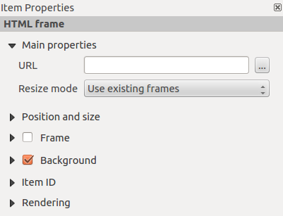
Add an HTML frame to the Print Composer
It is possible to add a clickable frame linked to a URL: Click the Add HTML frame icon, place the element with
the left mouse button on the Print Composer canvas and position and customize the appearance in the Item Properties tab.
Propriedades principais
The Main properties dialog of the HTML frame Item Properties tab
provides the following functionalities (see figure_composer_26):
Figure Composer 26:
- Point the URL field to the URL or the HTML file you want to insert in the Composer.
- You can adjust the rendering of the page with the Resize mode.
- Use existing frames constrains the page inside its first frame or in the frame created with the next settings.
- Extent to next page will create as many frames (and corresponding pages) as necessary to render the height of the web page. Each frame can be
moved around on the layout. If you resize a frame, the webpage will be divided up between the other frames. The last frame will be trimmed to
fit the web page.
- Repeat on every page will repeat the upper left of the web page on every page in frames of the same size.
- Repeat until finished will also create as many frames as the Extend to next page option, except all frames will have the same
size.
Manage items
Size and position
Each item inside the Composer can be moved/resized to create a perfect layout.
For both operations the first step is to activate the Select/Move item
tool and to click on the item; you can then move it using the mouse while holding the left button.
If you need to constrain the movements to the horizontal or the vertical axis, just hold
the Shift while moving the mouse.
If you need a better precision, you can move a selected item using the Arrow keys on the keyboard;
if the movement is too slow, you can speed up it by holding Shift.
A selected item will show squares on its boundaries; moving one of them with the mouse, will resize the item
in the corresponding direction.
While resizing, holding Shift will maintain the aspect ratio. Holding Ctrl will resize from
the item center.
The correct position for an item can be obtained using snapping to grid or smart guides. If you need to
disable the snap on the fly just hold Ctrl while moving the mouse.
You can choose multiple items with the Select/Move item button.
Just hold the Shift button and click on all the items you need. You can then resize/move
this group just like a single item.
Once you have found the correct position for an item, you can lock it by clicking with the
right mouse button. Press the same button another time to unlock it. You can also lock/unlock
items using the icons on the toolbar.
To unselect an item, just click on it holding the Shift button.
Inside the menu, you can find actions to select all the items, to clear all selections or
to invert the current selection.
Alignment
Raising or lowering functionalities for elements are inside the
Raise selected items pull-down menu. Choose an element on the Print Composer
canvas and select the matching functionality to raise or lower the selected
element compared to the other elements (see table_composer_1).
Figure Composer 27:
There are several alignment functionalities available within the
Align selected items pull-down menu (see table_composer_1). To use an
alignment functionality, you first select some elements and then click on the
matching alignment icon. All selected elements will then be aligned within to their common
bounding box.
When moving items on the Composer canvas, alignment helper lines appear when borders, centers or corners are aligned.
Copy/Cut and Paste items
The print composer includes actions to use the common Copy/Cut/Paste functionality for the items
in the layout. As usual first you need to select the items using one of the options seen above;
at this point the actions can be found in the menu. When using the Paste action, the elements
will be pasted according to the current mouse position.
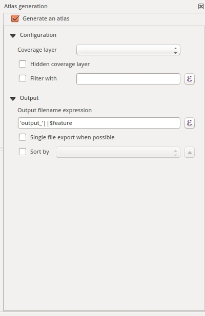
Geração de Atlas
The Print Composer includes generation functions that allow you to create map books
in an automated way. The concept is to use a coverage layer, which contains
geometries and fields. For each geometry in the coverage layer, a new output
will be generated where the content of some canvas maps will be moved to
highlight the current geometry. Fields associated with this geometry can be used
within text labels.
Every page will be generated with each feature. To enable the generation
of an atlas and access generation parameters, refer to the Atlas generation
tab. This tab contains the following widgets (see Figure_composer_29):
Figure Composer 29:
You can use multiple map items with the atlas generation; each map will be rendered according
to the coverage features. To enable atlas generation for a specific map item, you need to check
Controlled by Atlas under the item properties of the map item. Once checked, you can set:
- An input box Margin around feature that allows you to select the amount
of space added around each geometry within the allocated map. Its value is
meaningful only when using the auto-scaling mode.
- A Fixed scale that allows you to toggle between auto-scale
and fixed-scale mode. In fixed-scale mode, the map will only be translated for
each geometry to be centered. In auto-scale mode, the map’s extents are computed
in such a way that each geometry will appear in its entirety.
Labels
In order to adapt labels to the feature the atlas plugin iterates over, use a label with this special notation
[%expression using field_name%].
For example, for a city layer with fields CITY_NAME and ZIPCODE, you could insert this:
“[% ‘The area of ‘ || upper(CITY_NAME) || ‘,’ || ZIPCODE || ‘ is ‘ format_number($area/1000000,2) || ‘ km2’ %]“
That would result in the generated atlas as
“The area of PARIS,75001 is 1.94 km2”.
Preview
Once the atlas settings have been configured and map items selected, you can create a preview of all the pages by
clicking on and using the arrows, in the same menu, to navigate
through all the features.
Criação
The atlas generation can be done in different ways. For example, with , you can directly print it. You can also create a PDF using : The user will be asked for a directory for saving all the generated PDF files (except if the Single file export when possible has been selected).
If you need to print just a page of the atlas, simply start the preview function, select the page you need and click on (or create a PDF).
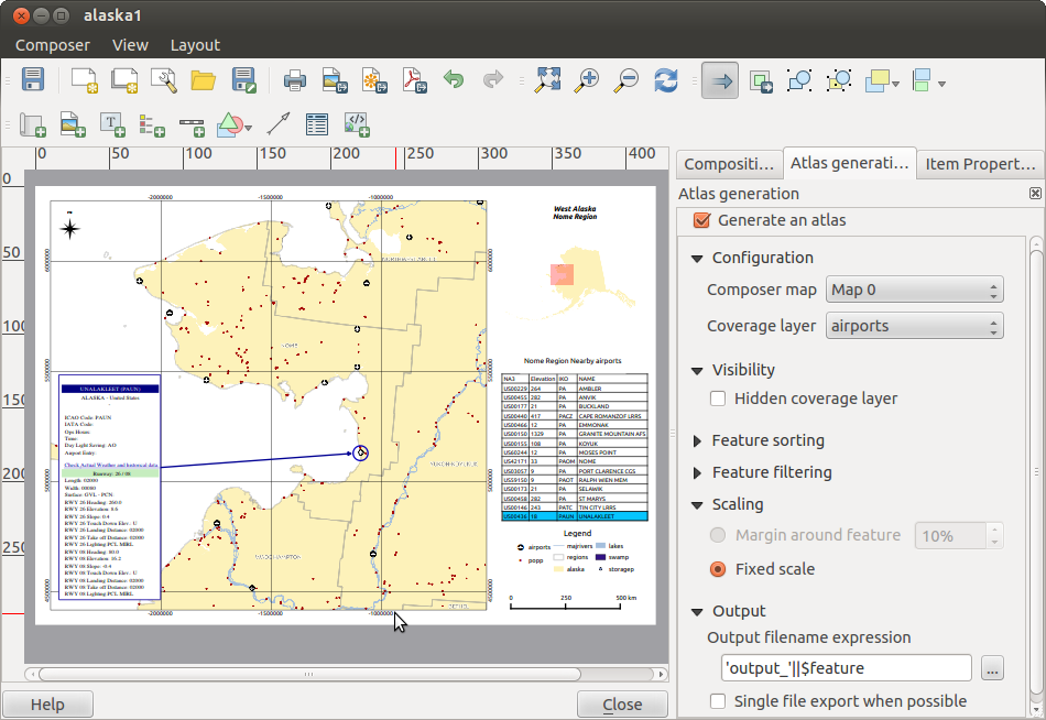
Criando um ficheiro de Saída
Figure_composer_30 shows the Print Composer with an example print layout,
including each type of map element described in the sections above.
Figure Composer 30:
The Print Composer allows you to create several output formats, and it is possible
to define the resolution (print quality) and paper size:
- The Print icon allows you to print the layout to a
connected printer or a PostScript file, depending on installed printer drivers.
- The Export as image icon exports the Composer
canvas in several image formats, such as PNG, BPM, TIF, JPG,...
- Export as PDF saves the defined Print Composer
canvas directly as a PDF.
- The Export as SVG icon saves the Print Composer canvas
as an SVG (Scalable Vector Graphic).
If you need to export your layout as a georeferenced image (i.e., to load back
inside QGIS), you need to enable this feature under the Composition tab. Check
World file on and choose the map item to use. With this option, the
‘Export as image’ action will create also a world file.
Note
Currently, the SVG output is very basic. This is not a QGIS problem, but a
problem with the underlying Qt library. This will hopefully be sorted out in
future versions.
Exporting big rasters can sometimes fail, even if there seems to be enough memory.
This is also a problem with the underlying Qt management of rasters.
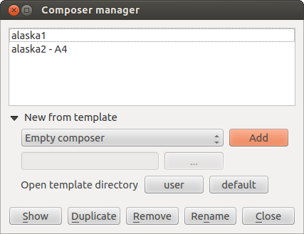
Gerir o Compositor
With the Save as template and
Load from template icons, you can save the current state of a Print Composer
session as a .qpt template and load the template again in another session.
The Composer Manager button in the QGIS toolbar
and in allows you to add a new Composer
template, create a new composition based on a previously saved template or to manage
already existing templates.
Figure Composer 31:
By default, the Composer manager searches for user templates in ~/.qgis2/composer_template.
The New Composer and Duplicate Composer
buttons in the QGIS toolbar and in and
allow you to open a new Composer dialog, or to
duplicate an existing composition from a previously created one.
Finally, you can save your print composition with the Save Project button.
This is the same feature as in the QGIS main window. All changes will be saved in a QGIS project
file.

