Compositor de impressão
The print composer provides growing layout and printing capabilities. It allows
you to add elements such as the QGIS map canvas, text labels, images, legends, scalebars, basic
shapes, arrows, attribute tables and HTML frames. You can size, group, align and position each
element and adjust the properties to create your layout. The layout can be printed
or exported to image formats, Postscript, PDF or to SVG (export to SVG is not
working properly with some recent Qt4 versions, you should try and check
individual on your system). You can save the layout as template and load it again
in another session. Finally, generating several maps based on a template can be done throught the Atlas generator
See a list of tools in table_composer_1:
ícone
|
Finalidade
|
ícone
|
Finalidade
|
|---|
| |
|
|
|
 |
Save Project |
 |
New Composer |
 |
Duplicate Composer |
 |
Composer Manager |
 |
Carregar um modelo de impressão
|
 |
Salvar como modelo de impressão
|
 |
Exportar para formato de imagem
|
 |
Exportar para PDF
|
 |
Exportar como SVG
|
 |
Imprimir ou exportar para Postscript
|
 |
Ver tudo
|
 |
Aproximar
|
 |
Afastar
|
 |
Atualizar visualização
|
 |
Desfazer ultima modificação
|
 |
Restaurar ultima modificação
|
 |
Add new map from QGIS map canvas |
 |
Adicionar imagem ao leiaute
|
 |
Adicionar rótulo (texto)
|
 |
Adicionar legenda
|
 |
Adicionar barra de escala
|
 |
Adicionar formas básicas
|
 |
Adicionar seta
|
 |
Adicionar tabela de atributos
|
 |
Add a HTML Frame |
|
|
 |
Selecionar/mover item na tela do compositor
|
 |
Mover conteúdo do mapa
|
 |
Agrupar itens
|
 |
Desagrupar itens
|
 |
Elevar itens selecionados
|
 |
Abaixar itens selecionados
|
 |
Mover itens selecionados para o topo
|
 |
Mover itens selecionados para a base
|
 |
Alinhar itens selecionados à esquerda
|
 |
Alinhar itens selecionados à direita
|
 |
Alinhar itens selecionados ao centro
|
 |
Alinhar itens selecionados na vertical
|
 |
Alinhar itens selecionados ao topo
|
 |
Alinhar itens selecionados á base
|
Tabela 1 Compositor: Ferramentas do compositor de impressão
All Print Composer tools are available in menus and as icons in a toolbar. The
toolbar can be switched off and on using the right mouse button over the toolbar.
First steps
Abrir um novo modelo no Compositor de impressão
Before you start to work with the print composer, you need to load some raster
and vector layers in the QGIS map canvas and adapt their properties to suit your
own convenience. After everything is rendered and symbolized to your liking,
click the New Print Composer icon in the toolbar or
choose . You will be prompt to
choose a title for the new composer.
Usando o Compositor de Impressão
Opening the print composer provides you with a blank canvas to which you can add
the current QGIS map canvas, text labels, images, legends, scalebars, basic
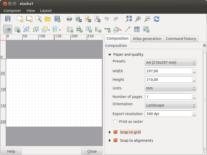
shapes, arrows, attribute tables and HTML frames. Figure_composer_1 shows the initial view of the print composer with an
activated  Snap to grid mode but before any elements are
added.
Snap to grid mode but before any elements are
added.
Figure Composer 1:
The print composer provides four tabs:
You can add multiple elements to the composer. It is also possible to have more
than one map view or legend or scalebar in the print composer canvas, on one or
several pages. Each element has its own properties and in the case of the map,
its own extent. If you want to remove any elements from the composer canvas you
can do that with the Delete or the Backspace key.
Composition tab — General composition setup
In the Composition tab, you can define the global settings of your composition.
- You can choose one of the Presets for your papersheet, or enter your custom width and height.
- Composition can now be parted on several pages. For instance, a first page can show a map canvas and a second
page will show the attribute table associated to a layer while a third ons shows a HTML frame linking to your organization website.
Set the Number of pages to the desired value.
- Choose the page Orientation and its Exported resolution
- When checked, the print as raster means all elements will be rasterized before printing or saving as Postscript or
PDF.
- Snap to grid and Snap to alignements tools make accomplishing some tasks much easier. There’s three types of grid:
Dots, Solid lines and Crosses. You can adjust spacings, offsets and color to your need.
- Selection tolerance defines the maximum distance below which an item is snapped to the grid.
- Snap to alignements shows helping lines when the borders or axis of two items are aligned.
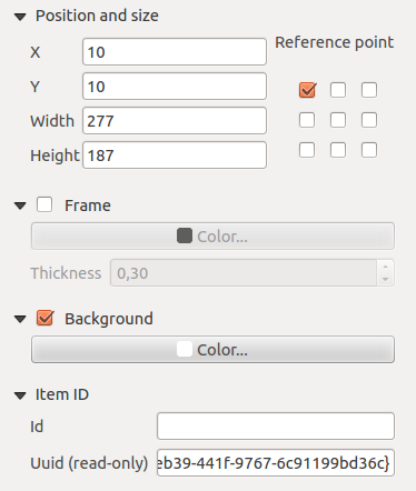
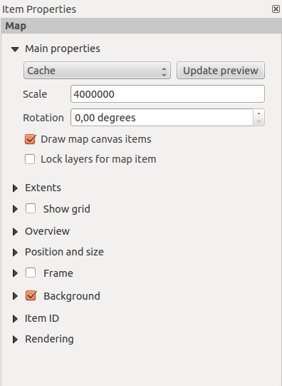
Composer items general options
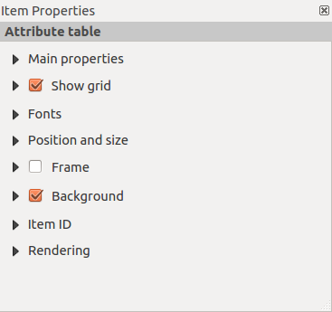
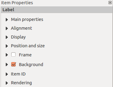
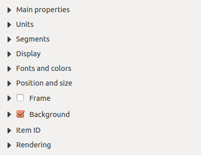
Composer items have a set of common properties you will find on the bottom of the Item Properties tab: Position and size, Frame,
Background, Item ID and Rendering (See figure_composer_2)
Figure Composer 2:
- The Position and size dialog lets you define size and position of the frame that contains the item. You can also choose
which Reference point will be set at the X and Y coordinates previously defined.
- The Frame shows or hides the frame around the label.
Click on the [Color] and [Thickness] buttons to adjust those properties.
- the Background enables or disables a background color.
Click on the [Color...] button to display a dialog where you pick a color ou choose frome a custom setting.
Transparency can also be adjusted throught the alpha field.
- Use the Item ID to create a relationship to other print composer items.
- Rendering mode can be selected in the option field. See Rendering_Mode .
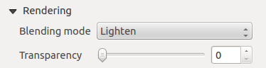
Rendering mode
QGIS now allows advanced rendering for composer items just like vector and raster layers.
Figure Composer 3:
Transparency  : you can make the underlying item in the composer
visible with this tool. Use the slider to adapt the visibility of your item to your needs.
You can also make a precise definition of the percentage of visibility in the the menu beside the slider.
: you can make the underlying item in the composer
visible with this tool. Use the slider to adapt the visibility of your item to your needs.
You can also make a precise definition of the percentage of visibility in the the menu beside the slider.
Blending mode: you can achieve special rendering effects with these tools that you
previously only know from graphics programs. The pixels of your overlaying and underlaying items are mixed
through the settings described below.
- Normal: This is the standard blend mode which uses the alpha channel of the top pixel to blend with the Pixel beneath it; the colors aren’t mixed
- Lighten: It selects the maximum of each component from the foreground and background pixels. Be aware that the results tend to be jagged and harsh.
- Screen: Light pixels from the source are painted over the destination, while dark pixels are not. This mode is most useful for mixing the texture of one layer with another layer. E.g. you can use a hillshade to texture another layer
- Dodge: Dodge will brighten and saturate underlying pixels based on the lightness of the top pixel. So brighter top pixels cause the saturation and brightness of the underlying pixels to increase. This works best if the top pixels aren’t too bright, otherwise the effect is too extreme.
- Addition: This blend mode simply adds pixel values of one layer with the other. In case of values above 1 (in the case of RGB), white is displayed. This mode is suitable for highlighting features.
- Darken: Creates a resultant pixel that retains the smallest components of the foreground and background pixels. Like lighten, the results tend to be jagged and harsh
- Multiply: It multiplies the numbers for each pixel of the top layer with the corresponding pixel for the bottom layer. The results are darker pictures.
- Burn: Darker colors in the top layer causes the underlying layers to darken. Can be used to tweak and colorise underlying layers.
- Overlay: Combines multiply and screen blending modes. In the resulting picture light parts of the picture become lighter and dark parts become darker.
- Soft light: Very similar to overlay, but instead of using multiply/screen it uses color burn/dodge. This one is supposed to emulate shining a soft light onto an image.
- Hard light: Hard light is very similar to the overlay mode. It’s supposed to emulate projecting a very intense light onto an image.
- Difference: Difference subtracts the top pixel from the bottom pixel or the other way round, to always get a positive value. Blending with black produces no change, as values for all colors are 0.
- Subtract: This blend mode simply subtracts pixel values of one layer with the other. In case of negative values, black is displayed.
Composer Items
Adding a current QGIS map canvas to the Print Composer
Click on the Add new map toolbar button in the print
composer toolbar to add the QGIS map canvas. Now drag a rectangle on the composer
canvas with the left mouse button to add the map. To display the current map, you
can choose between three different modes in the map Item Properties
tab:
- Rectangle is the default setting. It only displays an empty box with a
message ‘Map will be printed here’.
- Cache renders the map in the current screen resolution. If case you zoom
in or out the composer window, the map is not rendered again but the image will
be scaled.
- Render means, that if you zoom in or out the composer window, the map will
be rendered again, but for space reasons, only up to a maximum resolution.
Cache é o modo padrão de visualização de mapas do compositor de impressão.
You can resize the map element by clicking on the
Select/Move item button, selecting the element, and dragging one of the
blue handles in the corner of the map. With the map selected, you can now adapt
more properties in the map Item Properties tab.
To move layers within the map element select the map element, click the
Move item content icon and move the layers within
the map element frame with the left mouse button. After you found the right place
for an element, you can lock the element position within the print composer
canvas. Select the map element and click on the right mouse button to  Lock the element position and again to unlock the element. You can lock
the map element also activating the Lock layers for map
item checkbox in the Map dialog of the Item Properties
tab.
Lock the element position and again to unlock the element. You can lock
the map element also activating the Lock layers for map
item checkbox in the Map dialog of the Item Properties
tab.
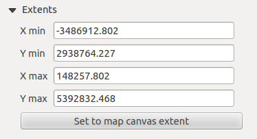
Extents
The Extents dialog of the map item tab provides following
functionalities (see Figure figure_composer_5):
Figure Composer 5:
- The Map extent area allow to specify the map extent using Y and X min/max
values or clicking the [Set to map canvas extent] button.
If you change the view on the QGIS map canvas by zooming or panning or changing
vector or raster properties, you can update the print composer view selecting
the map element in the print composer and clicking the [Update preview] button
in the map Item Properties tab (see Figure figure_composer_2).
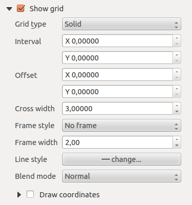
Grid
The Grid dialog of the map Item Properties tab provides
following functionalities (see Figure_composer_6):
Figure Composer 6:
- The Show grid checkbox allows to overlay a grid to the
map element. As grid type you can specify to use solid line or cross. Symbology of
the grid can be chosen. See Section Rendering_Mode.
Furthermore you can define an interval in X and Y direction, an X and Y offset,
and the width used for cross or line grid type.
- You can choose to paint the frame with a Zebra style. If not selected, general frame option is used (See Section Frame_dialog)
Advanced rendering mode is also available for grids. See Section Rendering_mode)
- The Draw coordinates checkbox allows to add coordinates
to the map frame. The annotation can be drawn inside or outside the map frame.
The annotation direction can be defined as horizontal, vertical, horizontal and
vertical, or boundary direction, for each border individually. Units can be in meters or in degrees. Finally you can define the grid
color, the annotation font, the annotation distance from the map frame and the precision of the drawn coordinates.
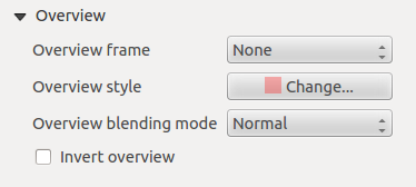
Overview
The Overview dialog of the map Item Properties tab provides
following functionalities (see Figure_composer_7):
Figure Composer 7:
If the composer has more than one map, you can choose to use a map to show the extents of a second map.
The Overview dialog of the map Item Properties tab allows to customize the appearance of that feature.
- The Overview frame combolist references the map item whose extents will be drawn on the present map item.
- The Overview Style allows to change the frame color. See Section vector_style_manager .
- The Overview Blend mode allows different transparency blend modes, to enhance visibility of the frame. See Rendering_Mode
- If checked, the Invert overview creates a mask around the extents : the referenced map extents are shown clearly
whereas everything else is blended with the frame color.
Adding a Label item to the Print Composer
To add a label, click the Add label icon, place the element
with the left mouse button on the print composer canvas and position and customize
its appearance in the label Item Properties tab.
The Item Properties tab of a Label item provides following functionalities:
Figure Composer 8:
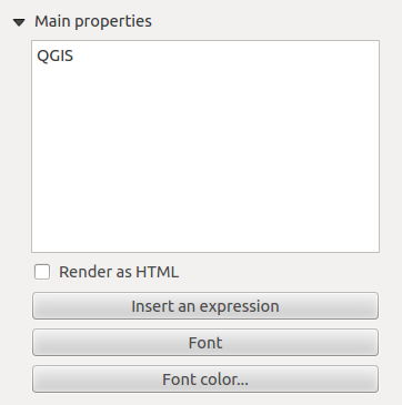
Main properties
The Main properties dialog of the Label Item Properties tab provides
following functionalities (see Figure_composer_9):
Figure Composer 9:
- The Main properties dialog is where is inserted the text (html or not) or the expression needed to fill the label added to the composer
canvas.
- Labels can be interpreted as html code: check the Render as HTML. You can now insert a url, an clickable
image that link to a web page or something more complex.
- You can also insert an expression. Click on the [Insert an expression] to open a new dialog. Build an expression by clicking the
functions available in the left side of the panel. On the right side of the Insert an expression dialog is displayed the help file
associated with the function selected. Two special categories can be useful, particularly associted with the Atlas functionnality :
geometry functions and records functions. On the bottom side, a preview of the expression is shown.
- Define font and font color by clicking on the [Font] and [Font color...] buttons
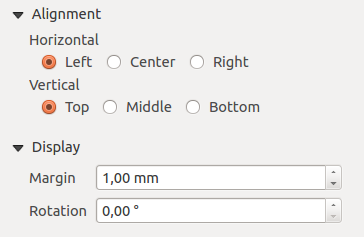
Alignment and Display
The Alignment and Display dialogs of the Label Item Properties tab provide
following functionalities (see Figure_composer_10):
Figure Composer 10:
- You can define the horizontal and vertical alignment in the Alignment zone
- In the Display tag, you can define a margin in mm and/or a rotation angle in degrees for the text.
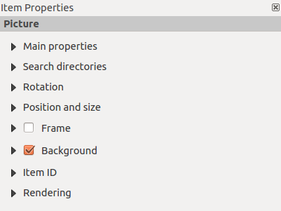
Adding an Image item to the Print Composer
To add an image, click the Add image icon, place the element
with the left mouse button on the print composer canvas and position and customize
its appearance in the image Item Properties tab.
The image Item Properties tab provides following functionalities (see figure_composer_11):
Figure Composer 11:
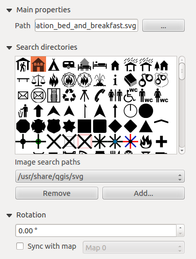
Main properties, Search directories and Rotation
The Main properties and Search directories dialogs of the Image Item Properties tab provide
following functionalities (see Figure_composer_12):
Figure Composer 12:
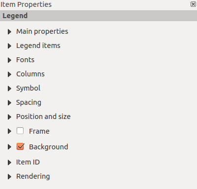
Adding a Legend item to the Print Composer
To add a map legend, click the Add new legend icon,
place the element with the left mouse button on the print composer canvas and
position and customize their appearance in the legend Item Properties
tab.
The Item properties of a legend item tab provides following
functionalities (see figure_composer_14):
Figure Composer 13:
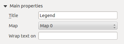
Main properties
The Main properties dialog of the legend Item Properties tab
provides following functionalities (see figure_composer_14):
Figure Composer 14:
- Here you can adapt the legend title.
- Choose which Map item the current legend will refer to in the select list.
- Since QGIS 1.8, you can wrap the text of the legend title to a given character.
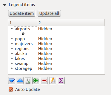
Legend items
The Legend items dialog of the legend Item Properties tab
provides following functionalities (see figure_composer_15):
Figure Composer 15:
- The legend items window lists all legend items and allows to change item order,
group layers, remove and restore items of the list, edit layer names. After changing the
symbology in the QGIS main window you can click on [Update] to adapt the
changes in the legend element of the print composer. The item order can be
changed using the [Up] and [Down] buttons or with ‘drag and drop’
functionality.
- The feature count for each vector layer can be shown by enable the [Sigma] button.
- Legend can be updated automatically, Auto-update is checked.
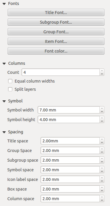
Fonts, Columns, Symbol and Spacing
The Fonts, Columns, Symbol and Spacing dialogs of the legend Item Properties tab
provide following functionalities (see figure_composer_16):
Figure Composer 16:
- You can change the font of the legend title, group, subgroup and item (layer) in the legend item. Click on a category button to open a
Select font dialog.
- All those items will get the same Color
- Legend items can be arranged in several columns. Select the correct value in the Count
 field.
- The Equal columns widths sets how legend columns should be adjusted.
- The Split layers option allows a categorized or a graduated layer legend to be divided upon columns.
- You can change width and height of the legend symbol in this dialog.
- Spacing aroung title, group, subgroup, symbol, icon label, box space or column space can be customized throught that dialog.
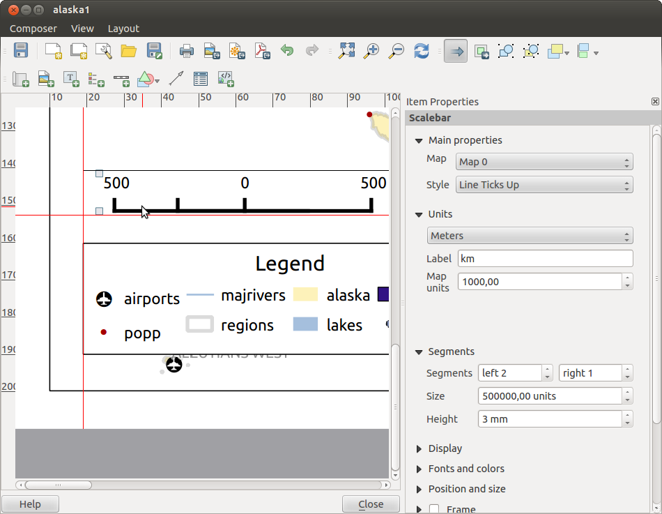
Adding a Scalebar item to the Print Composer
To add a scalebar, click the Add new scalebar icon, place
the element with the left mouse button on the print composer canvas and position
and customize their appearance in the scalebar Item Properties tab.
The Item properties of a scalebar item tab provides following
functionalities (see figure_composer_17):
Figure Composer 17:
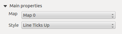
Main properties
The Main properties dialog of the scalebar Item Properties tab
provides following functionalities (see figure_composer_18):
Figure Composer 18:
- First choose the map the scalebar will be attached to.
- then choose the style of your scalebar. Six styles are available :
- Single box and Double box styles which contain one or two lines of boxes alternating colors,
- Middle, Up or Down line ticks,
- Numeric : the scale ratio is printed, i.e. 1:50000.
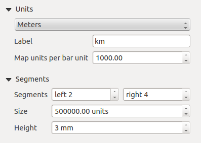
Units and Segments
The Units and Segments dialogs of the scalebar Item Properties tab
provide following functionalities (see figure_composer_19):
Figure Composer 19:
In those two dialogs, you can set how the scalebar will be represented.
- Select the map units used. There’s three possible choices : Map Units is the automated unit
selection, Meters or Feet force unit conversions.
- The Label field defines the text used to describe the unit of the scalebar.
- The Map units per bar unit allows to fix the ratio between a map unit and its representation in the scalebar.
- You can define how many Segments will be drawn on the left and on the right side of the scalebar,
and how long will be each segment (Size field). Height can also be defined.
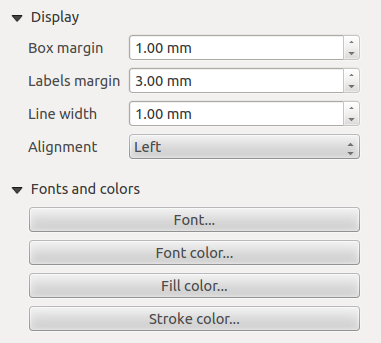
Display, Fonts and colors
The Display and Fonts and colors dialogs of the scalebar Item Properties tab provide following functionalities (see figure_composer_20):
Figure Composer 20:
- You can define how the scalebar will be displayed in its frame. Adjust the Box margin between text and frame borders,
Labels margin between text and scalebar drawing and the Line width of the scalebar drawing.
- The Alignment in the Display dialog only applies to Numeric styled scalebars and puts text on the
left, middle or right side of the frame.
Adding a Basic shape or Arrow item to the Print Composer
It is possible to add basic shapes (Ellipse, Rectangle, Triangle) and arrows
to the print composer canvas : click the Add basic shape icon or the
Add Arrow icon, place the element with the left mouse button on the print composer canvas and position
and customize their appearance in the Item Properties tab.
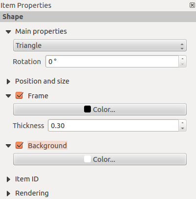
The Shape Item properties tab allows to draw an ellipse, rectangle, or triangle
in the print composer canvas. You can define its outline and fill color, the
outline width and a clockwise rotation.
Figure Composer 21:
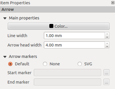
The Arrow Item properties tab allows to draw an arrow in the print composer canvas.
You can define color, outline and arrow width and it is possible to use a default
marker and no marker and a SVG marker. For the SVG marker you can additionally
add a SVG start and end marker from a directory on your computer.
Figure Composer 22:
Main properties
- For Basic shapes, this dialog allows you to choose a Ellipse, Rectangle or Triangle shape and its rotation.
- Unlike the other items, line style, line color and background color of a basic shape are adjusted with the Frame and Background dialog.
No frame is drawn.
- For arrows, you can define here the line style : Color, Line width and Arrow head width.
- Arrows markers can be adjusted. If you want to set a SVG Start marker and/or End marker, browse to
your SVG file by clicking on the [...] button after selecting SVG radio button.
Nota
Unlike other items, background color for a basic shape is the shape background and not the frame one.
Add attribute table values to the Print Composer
It is possible to add parts of a vector attribute table to the print composer
canvas : click the Add attribute table icon, place the element with the left mouse button on the print composer
canvas and position and customize their appearance in the Item Properties tab.
The Item properties of a attribute table item tab provides following
functionalities (see figure_composer_23):
Figure Composer 23:
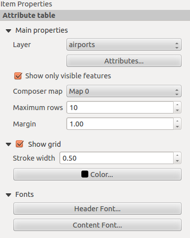
Main properties, Show grid and Fonts
The Main properties, Show grid and Fonts dialogs of the attribute table Item Properties tab
provide following functionalities (see figure_composer_24):
Figure Composer 24:
Figure Composer 25:
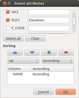
- The Table dialog allows to select the vector layer and columns of the attribute table. Attribute columns can be sorted and you
can define to show its values ascending or descending (see figure_composer_25).
- You can choose to display only the attribute of features visibled on a map. Check Show only visible features and
select the corresponding Composer map to filter.
- You can define the Maximum number of rows to be displayed and margin around text.
- Additionally you can define the grid characteristics of the table (Stroke width and Color of the grid) and the
header and content font.
Add a HTML frame to the Print Composer
It is possible to add a clickable frame, linked to an URL : click the Add html frame icon, place the element with
the left mouse button on the print composer canvas and position and customize their appearance in the Item Properties tab.
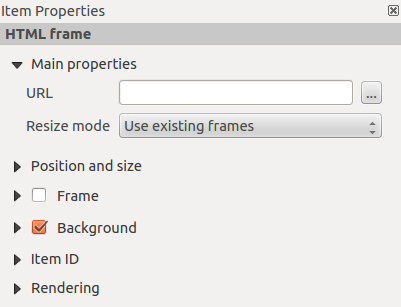
Main properties
The Main properties dialog of the HTML frame Item Properties tab
provides following functionalities (see figure_composer_26):
Figure Composer 26:
- Point the URL field to the URL or the HTML file you want to insert in the composer.
- You can adjust the rendering of that page with the Resize mode.
- Use existing frames constraints the page inside its first frame or in the frame created with the next settings.
- Extent to next page will create as many frames (and their pages) as necessary to render the height of the webpage. Each frame can be
moved around on the layout. If you resize a frame, the webpage will be divided up upon the other frames. The last frame will be trimmed to
fit the webpage.
- Repeat on every page will first repeat the upper left of the webpage on every page, in same sized frames.
- Repeat until finished will also create as many frames as the Extend to next page option, except All frames will have the same
size.
Item alignment
As funcionalidades de elevar ou abaixar os elementos são encontradas no menu suspenso elevar itens selecionados. Escolha um elemento na tela do compositor de impressão e selecione a funcionalidade correspondente para aumentar ou diminuir o elemento selecionado em relação aos outros elementos (ver table_composer_1).
Figure Composer 27:
There are several alignment functionalities available within the
Align selected items pulldown menu (see table_composer_1). To use an
alignment functionality , you first select some elements and then click on the
matching alignment icon. All selected will then be aligned within to their common
bounding box.
When moving items on the composer canvas, alignment helper lines appear when borders, centers or corners are aligned.
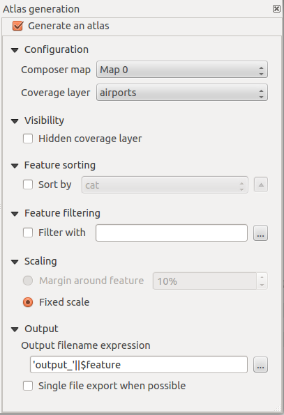
Geração de Atlas
O compositor de impressão inclui funções que permitem a criação de livros de mapas de uma forma automática. O conceito consiste em utilizar uma camada de cobertura, que contém geometrias e campos. Para cada geometria da camada de cobertura, uma nova saída será gerada quando o teor dos mapas da tela forem movidos para destacar a geometria actual. Campos associados a esta geometria podem ser usados dentro de etiquetas de texto.
There can only be one atlas map by print composer but this one can contain multiple pages.
Every pages will be generated with each feature. To enable the generation
of an atlas and access generation parameters, refer to the Atlas generation
tab. This tab contains the following widgets (see Figure_composer_29):
Figure Composer 29:
In order to adapt labels to the feature the atlas plugin iterates over, use a label with this special notation
[%expression using field_name%].
For example, with a city layer with fields CITY_NAME and ZIPCODE, you could insert this :
“[% ‘The area of ‘ || upper(CITY_NAME) || ‘,’ || ZIPCODE || ‘ is ‘ format_number($area/1000000,2) || ‘ km2’ %]“
And that would result in the generated atlas as
“The area of PARIS,75001 is 1.94 km2”.
Geração
The atlas generation is done when the user asks for a print or an export. The behaviour of these functions will be slightly changed if an atlas map has been selected. For instance, when the user asks for an export to PDF, if an atlas map is defined, the user will be asked for a directory where to save all the generated PDF files (except if the Single file export when possible has been selected).
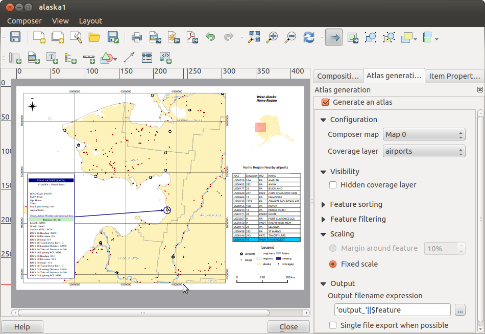
Criação de saídas
Figure_composer_30 shows the print composer with an example print layout
including each type of map element described in the sections above.
Figure Composer 30:
O compositor de impressão permite criar vários formatos de saída, é possível definir a resolução (qualidade de impressão) e tamanho do papel:
O ícone Imprimir permite imprimir o leiaute para uma impressora conectada ao computador ou em um arquivo Postscript dependendo dos drivers de impressoras instalados.
- The Export as image icon exports the composer
canvas in several image formats such as PNG, BPM, TIF, JPG,...
O ícone :sup:’Exportar como PDF`salva a tela do compositor de impressão definida diretamente como PDF.
O ícone :sup:’Exportar como SVG ` salva a tela do compositor de impressão como um SVG (Scalable Vector Graphic).
Nota
Currently the SVG output is very basic. This is not a QGIS problem, but a
problem of the underlaying Qt library. This will hopefully be sorted out in
future versions.
Export big raster can sometimes fail, even if there seems to be enough memory.
This is also a problem of the underlaying Qt management of raster.
Manage the Composer
With the Save as template and
Load from template icons you can save the current state of a print composer
session as a .qpt template and load the template again in another session.
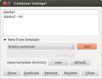
The Composer Manager button in the QGIS toolbar
and in allows to add a new composer
template, create a new composition based on a previously saved template or to manage
already existing templates.
Figure Composer 31:
By default, the composer manager searches for user templates in ~/.qgis2/composer_template.
The New Composer and Duplicate Composer
buttons in the QGIS toolbar and in and
allow to open a new composer dialog, or to
duplicate an existing composition from a previously created one.
Finally you can save your print composition with the Save Project button.
This is the same feature as in the QGIS main window. All changes will be saved in a QGIS project
file.
