Print Composer
The print composer provides growing layout and printing capabilities. It allows you to add elements such as the QGIS map canvas, legend, scalebar, images, basic shapes, arrows and text labels. You can size, group, align and position each element and adjust the properties to create your layout. The layout can be printed or exported to image formats, Postscript, PDF or to SVG (export to SVG is not working properly with some recent Qt4 versions. You should try and check individual on your system). You can save the layout as template and load it again in another session. See a list of tools in table_composer_1:
| Icon | Purpose | Icon | Purpose |
|---|---|---|---|
 |
Load from template |  |
Save as template |
 |
Export to an image format |  |
Export as PDF |
 |
Export print composition to SVG |  |
Print or export as Postscript |
 |
Zoom to full extent |  |
Zoom in |
 |
Zoom out |  |
Refresh view |
 |
Revert last change |  |
Restore last change |
 |
Add new map from QGIS map canvas |  |
Add image to print composition |
 |
Add label to print composition |  |
Add new legend to print composition |
 |
Add new scalebar to print composition |  |
Add basic shape to print composition |
 |
Add arrow to print composition |  |
Add attribute table to print composition |
 |
Select/Move item in print composition |  |
Move content within an item |
 |
Group items of print composition |  |
Ungroup items of print composition |
 |
Raise selected items |  |
Lower selected items |
 |
Move selected items to top |  |
Move selected items to bottom |
 |
Align selected items left |  |
Align selected items right |
 |
Align selected items center |  |
Align selected items center vertical |
 |
Align selected items top |  |
Align selected items bottom |
Table Composer 1: Print Composer Tools
All Print Composer tools are available in menus and as icons in a toolbar. The toolbar can be switched off and on using the right mouse button holding the mouse over the toolbar.
Open a new Print Composer Template
Before you start to work with the print composer, you need to load some raster
and vector layers in the QGIS map canvas and adapt their properties to suite your
own convenience. After everything is rendered and symbolized to your liking you
click the  New Print Composer icon in the toolbar or
choose File ‣ New Print Composer.
New Print Composer icon in the toolbar or
choose File ‣ New Print Composer.
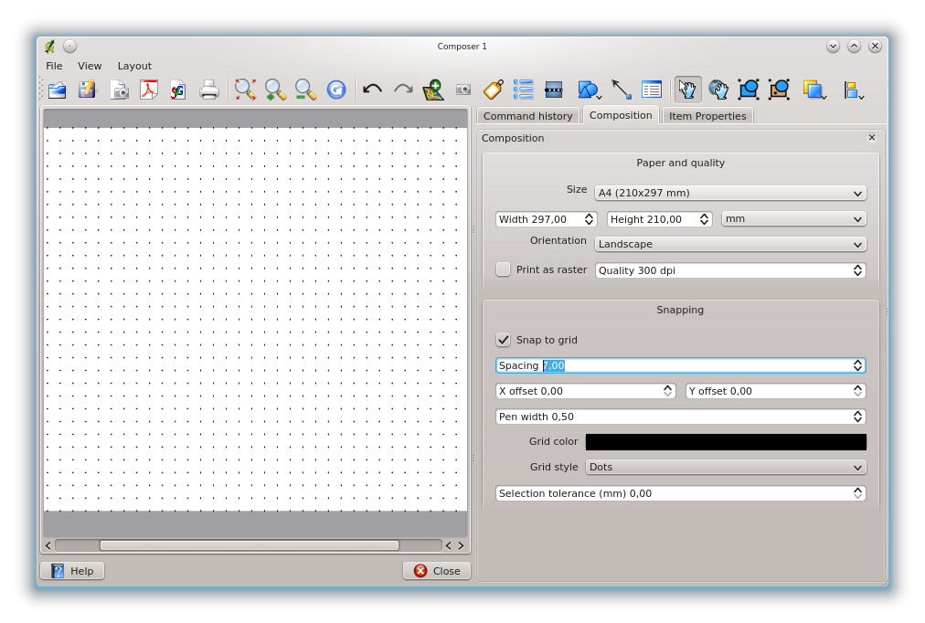
Using Print Composer
Opening the print composer provides you with a blank canvas to which you can add
the current QGIS map canvas, legend, scalebar, images, basic shapes, arrows and
text. Figure_composer_1 shows the initial view of the print composer with an
activated  Snap to grid mode but before any elements are
added.
Snap to grid mode but before any elements are
added.
Figure Composer 1:
Print Composer 
The print composer provides three tabs:
- The Composition tab allows you to set paper size, orientation, the
print quality for the output file in dpi and to activate snapping to a grid of
a defined resolution. Please note, the Snap to grid
feature only works, if you define a grid resolution > 0. Furthermore you can
also activate the Print as raster checkbox. This means
all elements will be rastered before printing or saving as Postscript of PDF.
- The Item Properties tab displays the properties for the selected
map element. Click the Select/Move item icon to select
an element (e.g. legend, scalebar or label) on the canvas. Then click the
Item Properties tab and customize the settings for the selected
element.
- The Command history tab displays a history of all changes applied to the print composer layout. With a mouse click it is possible to undo and redo layout steps back and forth to a certain status.
You can add multiple elements to the composer. It is also possible to have more than one map view or legend or scalebar in the print composer canvas. Each element has its own properties and in the case of the map, its own extent. If you want to remove any elements from the composer canvas you can do that with the Delete or the Backspace key.
Adding a current QGIS map canvas to the Print Composer
Click on the Add new map toolbar button in the print
composer toolbar, to add the QGIS map canvas. Now drag a rectangle on the composer
canvas with the left mouse button to add the map. To display the current map, you
can choose between three different modes in the map Item Properties
tab:
- Rectangle is the default setting. It only displays an empty box with a message ‘Map will be printed here’.
- Cache renders the map in the current screen resolution. If case you zoom in or out the composer window, the map is not rendered again but the image will be scaled.
- Render means, that if you zoom in or out the composer window, the map will be rendered again, but for space reasons, only up to a maximum resolution.
Cache is default preview mode for newly added print composer maps.
You can resize the map element by clicking on the
Select/Move item button, selecting the element, and dragging one of the
blue handles in the corner of the map. With the map selected, you can now adapt
more properties in the map Item Properties tab.
To move layers within the map element select the map element, click the
Move item content icon and move the layers within
the map element frame with the left mouse button. After you found the right place
for an element, you can lock the element position within the print composer
canvas. Select the map element and click on the right mouse button to  Lock the element position and again to unlock the element. You can lock
the map element also activating the Lock layers for map
item checkbox in the Map dialog of the Item Properties
tab.
Lock the element position and again to unlock the element. You can lock
the map element also activating the Lock layers for map
item checkbox in the Map dialog of the Item Properties
tab.
註解
QGIS is now able to show labels from the new labeling plugin also in the map composer, but it is not yet scaled correctly. So it might be necessary to switch back to the standard labeling in some cases.
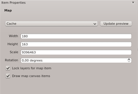
Map item properties tab — Map and Extents dialog
Map dialog
The Map dialog of the map Item Properies tab provides following functionalities (see figure_composer_2):
Figure Composer 2:
Map Dialog
- The Preview area allows to define the preview modes ‘Rectangle’, ‘Cache’ and ‘Render’, as described above. Click on the [Update preview] button to apply changes to the map view.
- The Map area allows to resize the map element specifying the width and
height or the scale. The field Rotation
 allows to
rotate the map element content clockwise in degrees. Note, a coordinate frame
can only be added with the default value 0. Furthermore you can enable the
checkboxes Lock layers for map items and
Draw map canvas items.
allows to
rotate the map element content clockwise in degrees. Note, a coordinate frame
can only be added with the default value 0. Furthermore you can enable the
checkboxes Lock layers for map items and
Draw map canvas items.
If you change the view on the QGIS map canvas by zooming or panning or changing vector or raster properties, you can update the print composer view selecting the map element in the print composer and clicking the [Update preview] button.
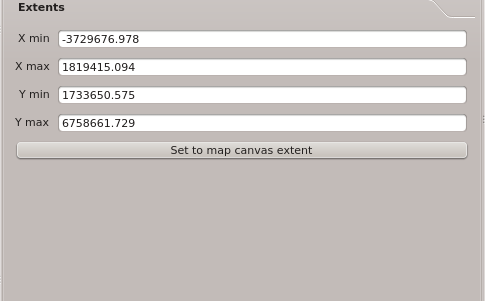
Extents dialog
The Extents dialog of the map item tab provides following functionalities (see Figure figure_composer_3)):
Figure Composer 3:
Extents Dialog
- The Map extent area allow to specify the map extent using Y and X min/max values or clicking the [Set to map canvas extent] button.
If you change the view on the QGIS map canvas by zooming or panning or changing vector or raster properties, you can update the print composer view selecting the map element in the print composer and clicking the [Update preview] button in the map Item Properties tab (see Figure figure_composer_2 a)).
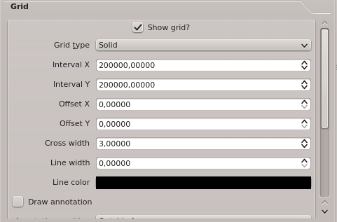
Map item properties tab — Grid and General options dialog
Grid dialog
The Grid dialog of the map Item Properties tab provides following functionalities (see Figure_composer_4):
Figure Composer 4:
Grid Dialog
- The Show grid checkbox allows to overlay a grid to the
map element. As grid type you can specify to use solid line or cross.
Furthermore you can define an interval in X and Y direction, an X and Y offset,
and the width used for cross or line grid type.
- The Draw annotation checkbox allows to add coordinates
to the map frame. The annotation can be drawn inside or outside the map frame.
The annotation direction can be defined as horizontal, vertical, horizontal and
vertical, or boundary direction. And finally you can define the grid color, the
annotation font, the annotation distance from the map frame and the precision
of the drawn coordinates.
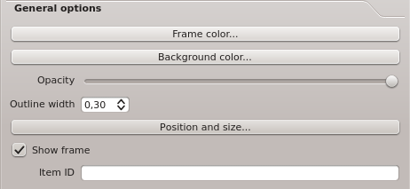
General options dialog
The General options dialog of the map Item Properties tab provides following functionalities (see Figure_composer_5):
Figure Composer 5:
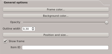
General Options Dialog
- Here you can define color and outline width for the element frame, set a
background color and opacity for the map canvas. The [Position and size]
button opens the Set item position dialog and allows to set the
map canvas position using reference points or coordinates. Furthermore you can
select or unselect to display the element frame with the
Show frame checkbox. With the Item ID you can create a
relationship to the other print composer items.
Adding other elements to the Print Composer
Besides adding a current QGIS map canvas to the Print Composer, it is also possible to add, position, move and customize legend, scalebar, images and label elements.
Label item properties tab - Label and General options dialog
To add a label, click the Add label icon, place the element
with the left mouse button on the print composer canvas and position and customize
their appearance in the label Item Properties tab.
Label dialog
The Label dialog of the label item tab provides following functionalities:
Figure Composer 6:
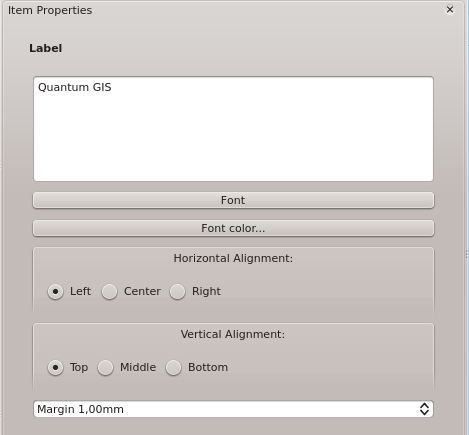
Label Options Dialog
- The Label dialog offers to add text labels to the composer canvas. You can define the horizontal and vertical alignment, select font and font color for the text and it is possible to define a text margin in mm.
General options dialog
The General options dialog of the label Item Properties tab provides following functionalities:
Figure Composer 7:
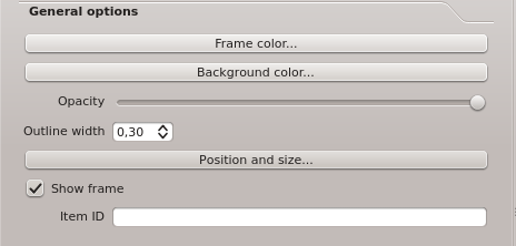
General Options Dialog
- Here you can define color and outline width for the element frame, set a
background color and opacity for the label. The Position button
opens the Set items position dialog and allows to set the map
canvas position using reference points or coordinates. Furthermore you can
select or unselect to display the element frame with the
Show frame checkbox. Use the Item ID to create a
relationship to other print composer items.
Image item properties tab - Picture options and General options dialog
To add an image, click the Add image icon, place
the element with the left mouse button on the print composer canvas and position
and customize their appearance in the image Item Properties tab.
Picture options dialog
The Picture options dialog of the image Item Properties tab provides following functionalities (see figure_composer_5 a):
Figure Composer 8:
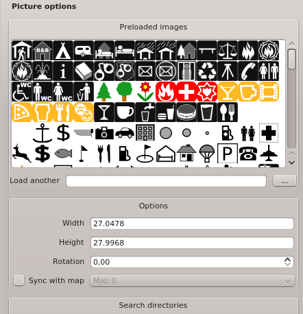
Picture Options Dialog Dialog
- The Preloaded Images field then shows all pictures stored in the selected directories.
- The Options area shows the current selected picture and allows to define
width, height and clockwise rotation of the picture. It is also possible to
add a user specific SVG path. Activating the Sync with
map checkbox synchronizes the rotation of a picture in the QGIS map canvas
(i.e. a rotated north arrow) with the appropriate print composer image.
- The Search directories area allows to add and remove directories with images in SVG format to the picture database.
General options dialog
The General options dialog of the image Item Properties tab provides following functionalities:
Figure Composer 9:
General Options Dialog Dialog
- Here you can define color and outline width for the element frame, set a
background color and opacity for the picture. The [Position and size]
button opens the Set item position dialog and allows to set the
map canvas position using reference points or coordinates. Furthermore you can
select or unselect to display the element frame with the
Show frame checkbox. With the Item ID you can create
a relationship to other print composer items.
Legend item properties tab - General, Legend items and Item option dialog
To add a map legend, click the Add new legend icon,
place the element with the left mouse button on the print composer canvas and
position and customize their appearance in the legend Item Properties
tab.
General dialog
The General dialog of the legend item tab provides following functionalities (see figure_composer_10):
Figure Composer 10:
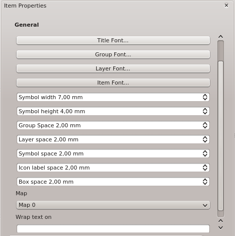
General Dialog
- Here you can adapt the legend title. You can change the font of the legend title, layer and item name. You can change width and height of the legend symbol and you can add layer, symbol, icon label and box space. Since QGIS 1.8, you can wrap the text of the legend title to a given character.
Legend items dialog
The Legend items dialog of the legend Item Properties tab provides following functionalities (see figure_composer_11):
Figure Composer 11:
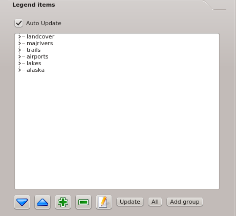
Legend Items Dialog
- The legend items window lists all legend items and allows to change item order, edit layer names, remove and restore items of the list. After changing the symbology in the QGIS main window you can click on [Update] to adapt the changes in the legend element of the print composer. The item order can be changed using the [Up] and [Down] buttons or with ‘drag and drop’ functionality.
General options dialog
The General options dialog of the legend Item Properties tab provides following functionalities (see figure_composer_12):
Figure Composer 12:
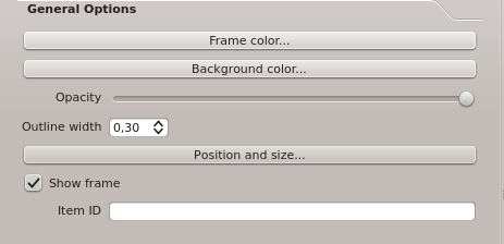
General Options Dialog
- Here you can define color and outline width for the element frame, set a
background color and opacity for the legend. The [Position and size] button
opens the Set item position dialog and allows to set the map canvas
position using reference points or coordinates. Furthermore you can select or
unselect to display the element frame with the Show frame
checkbox. Use the Item ID to create a relationship to other print
composer items.
Scalebar item properties tab - Scalebar and General options dialog
To add a scalebar, click the Add new scalebar icon, place
the element with the left mouse button on the print composer canvas and position
and customize their appearance in the scalebar Item Properties tab.
Scalebar dialog
The Scalebar dialog of the scalebar Item Properties tab provides following functionalities (see figure_composer_13):
Figure Composer 13:
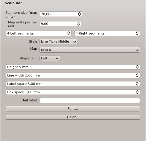
Scalebar Options Dialog
- The Scalebar dialog allows to define the segment size of the scalebar in map units, the map units used per bar units, and how many left and right segments units from 0 should be used.
- You can define the scalebar style, available is single and double box, line ticks middle, up and down and a numeric style.
- Furthermore you can define height, line width, label and box space of the scalebar. Add a unit label and define the scalebar font and color.
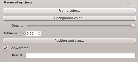
General options dialog
The General options dialog of the scalebar Item Properties tab provides following features (see figure_composer_7 b)):
Figure Composer 14:
General Options Dialog
- Here you can define color and outline width for the element frame, set a
background color and opacity for the scalebar. The [Position and size]
button opens the Set items position dialog and allows to set the
map canvas position using reference points or coordinates. Furthermore you can
select or unselect to display the element frame with the
Show frame checkbox. With the Item ID you can create
a relationship to the other print composer items.
Navigation tools
For map navigation the print composer provides 4 general tools:
- Zoom in
- Zoom out
- Zoom to full extend
- Refresh the view (if you find the view in an inconsistent
state)
Revert and Restore tools
During the layout process it is possible to revert and restore changes. This can be done with the revert and restore tools:
- Revert last changes
- Restore last changes
or by mouse click within the Command history tab (see figure_composer_9).
Figure Composer 16:
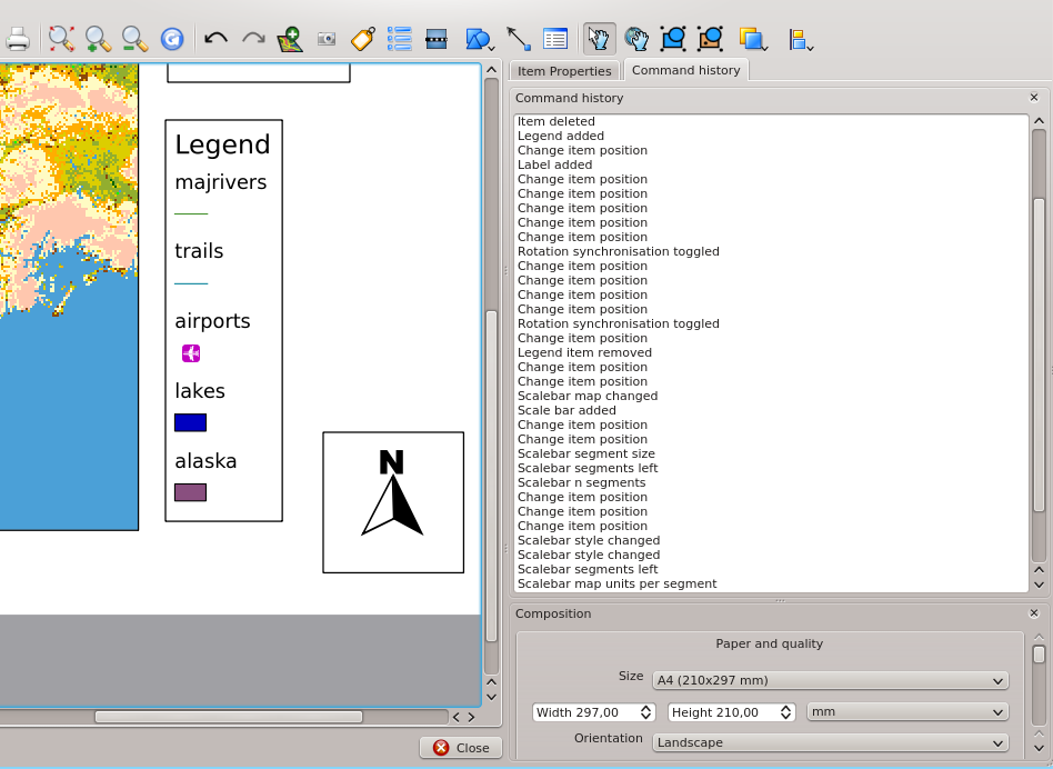
Command history in the Print Composer
Add Basic shape and Arrow
It is possible to add basic shapes (Ellipse, Rectangle, Triangle) and arrows to the print composer canvas.
The Shape dialog allows to draw an ellipse, rectangle, or triangle in the print composer canvas. You can define its outline and fill color, the outline width and a clockwise rotation.
Figure Composer 18:
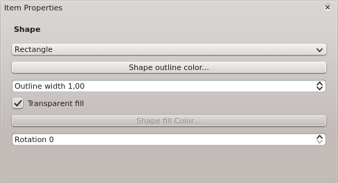
Shape Dialog
The Arrow dialog allows to draw an arrow in the print composer canvas. You can define color, outline and arrow width and it is possible to use a default marker and no marker and a SVG marker. For the SVG marker you can additionally add a SVG start and end marker from a directory on your computer.
Figure Composer 19:
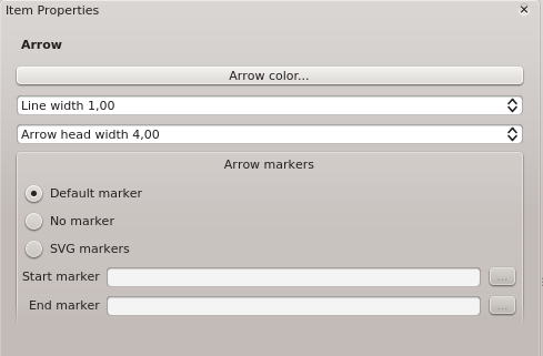
Arrow Dialog
Add attribute table values
It is possible to add parts of a vector attribute table to the print composer canvas.
Table dialog
The Table dialog of the attribute table item tab provides following functionalities (see figure_composer_20):
Figure Composer 20:
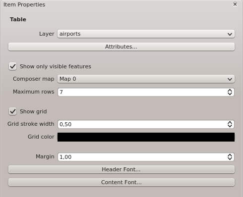
Table Dialog
- The Table dialog allows to select the vector layer and columns of the attribute table. Attribute columns can be sorted and you can define to show its values ascending or descending.
- You can define the maximum number of rows to be displayed and if attributes are only shown for visible features of the current composer canvas.
- Additionally you can define the grid characteristics of the table and the header and content font.
General options dialog
The General options dialog of the attribute table item tab provides following functionalities (see figure_composer_21):
Figure Composer 21:
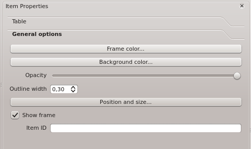
General Options Dialog
- Here you can define color and outline width for the element frame, set a
background color and opacity for the table. The [Position and size] button
opens the Set item position dialog and allows to set the map canvas
position using reference points or coordinates. Furthermore you can select or
unselect to display the element frame with the Show frame
checkbox. Use the Item ID to create a relationship to the other print composeritems.
Raise, lower and align elements
Raise or lower functionalities for elements are inside the
Raise selected items pulldown menu. Choose an element on the print composer
canvas and select the matching functionality to raise or lower the selected
element compared to the other elements (see table_composer_1).
There are several alignment functionalities available within the
Align selected items pulldown menu (see table_composer_1). To use an
alignment functionality , you first select some elements and then click on the
matching alignment icon. All selected will then be aligned within to their common
bounding box.
Creating Output
Figure_composer_22 shows the print composer with an example print layout including each type of map element described in the sections above.
Figure Composer 22:
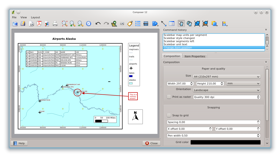
Print Composer with map view, legend, scalebar, coordinates and text added
The print composer allows you to create several output formats and it is possible to define the resolution (print quality) and paper size:
- The Print icon allows to print the layout to a
connected printer or a Postscript file depending on installed printer drivers.
- The Export as image icon exports the composer
canvas in several image formats such as PNG, BPM, TIF, JPG,...
- The Export as PDF saves the defined print composer
canvas directly as a PDF.
- The Export as SVG icon saves the print composer canvas
as a SVG (Scalable Vector Graphic).
註解
Currently the SVG output is very basic. This is not a QGIS problem, but a problem of the underlaying Qt library. This will hopefully be sorted out in future versions.
Saving and loading a print composer layout
With the Save as template and
Load from template icons you can save the current state of a print composer
session as a .qpt template and load the template again in another session.
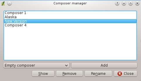
The  Composer Manager button in the QGIS toolbar
and in File ‣ Composer Manager allows to add a new composer
template or to manage already existing templates.
Composer Manager button in the QGIS toolbar
and in File ‣ Composer Manager allows to add a new composer
template or to manage already existing templates.
Figure Composer 23:
The Print Composer Manager