.
Dialogfenster Rasterlayereigenschaften
Um die Eigenschaften eines Rasterlayers zu sehen oder einzustellen doppelklicken Sie auf den Layernamen in der Legende oder rechtsklicken Sie auf den Layernamen und wählen Sie Eigenschaften aus dem Kontextmenü. Dies öffnet den Layereigenschaften Dialog (siehe figure_raster_1).
Es gibt mehrere Menüs in diesem Dialog:
Allgemein
Stil
Transparenz
Pyramiden
Histogramm
Metadaten
Figure Raster 1:
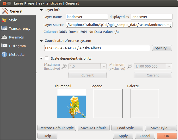
Raster Layers Properties Dialog 
Menü Stil
Kanaldarstellung
QGIS offers four different Render types. The renderer chosen is dependent on the data type.
Multikanalfarbe - wenn die Datei ein Multiband mit mehreren Kanälen ist (z.B. bei einem Satellitenbild mit mehreren Bändern)
Palette - wenn ein Einkanalbild eine indizierte Palette besitzt (z.B. benutzt bei digitalen Topographischen Karten)
- Singleband gray - (one band of) the image will be rendered as gray; QGIS will choose this renderer if the file has neither multibands nor an indexed palette nor a continous palette (e.g., used with a shaded relief map)
Einkanalpseudofarbe - diese Darstellung ist bei Dateien mit kontinuirlicher Palette oder Farbkarte (z.B. wie sie in Höhenkarten verwendet wird) möglich
Multikanalfarbe
Mit der Darstellung Multikanalfarbe werden drei ausgewählte Kanäle des Bildes dargestellt, wobei jedes Band due rote, grüne oder blaue Komponente zum Erstellen eines Farbbildes darstellt.
Figure Raster 2:
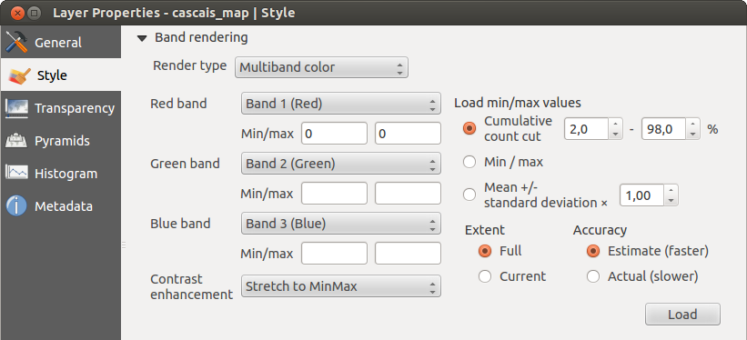
Raster Renderer - Multiband color
This selection offers you a wide range of options to modify the appearance
of your raster layer. First of all, you have to get the data range from your
image. This can be done by choosing the Extent and pressing
[Load]. QGIS can  Estimate (faster) the
Min and Max values of the bands or use the
Estimate (faster) the
Min and Max values of the bands or use the
 Actual (slower) Accuracy.
Now you can scale the colors with the help of the Load min/max values section.
A lot of images have a few very low and high data. These outliers can be eliminated
using the Cumulative count cut setting. The standard data range is set
from 2% to 98% of the data values and can be adapted manually. With this
setting, the gray character of the image can disappear.
With the scaling option Min/max, QGIS creates a color table with all of
the data included in the original image (e.g., QGIS creates a color table
with 256 values, given the fact that you have 8 bit bands).
You can also calculate your color table using the Mean +/- standard deviation x  .
Then, only the values within the standard deviation or within multiple standard deviations
are considered for the color table. This is useful when you have one or two cells
with abnormally high values in a raster grid that are having a negative impact on
the rendering of the raster.
.
Then, only the values within the standard deviation or within multiple standard deviations
are considered for the color table. This is useful when you have one or two cells
with abnormally high values in a raster grid that are having a negative impact on
the rendering of the raster.
All calculations can also be made for the Current extent.
Tipp
Einen einzelnen Kanal eines Mehrkanal-Rasterlayers anzeigen
Wenn Sie sich nur einen einzelnen Kanal eines Multikanalfarbe Bildes (z.B. Rot) ansehen wollen kommen Sie vielleicht auf die Idee den Grün- und Blaukanal auf ‘’Nicht gesetzt” einzustellen. Dies ist nicht der korrekte Weg. Um den Rotkanal darzustellen stellen Sie den Bildtyp auf ‘Einkanalgraustufen’ ein und wählen Sie dann Rot als Kanal, der für Grau benutzt werden soll, aus
Palette
This is the standard render option for singleband files that already include a color table, where each pixel value is assigned to a certain color. In that case, the palette is rendered automatically. If you want to change colors assigned to certain values, just double-click on the color and the Select color dialog appears. Also, in QGIS 2.2. it’s now possible to assign a label to the color values. The label appears in the legend of the raster layer then.
Figure Raster 3:
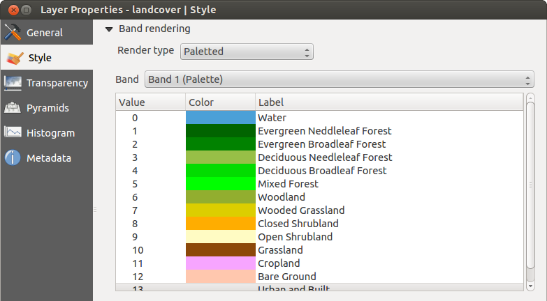
Raster Renderer - Paletted
Kontrastverbesserung
Bemerkung
When adding GRASS rasters, the option Contrast enhancement will always be set automatically to stretch to min max, regardless of if this is set to another value in the QGIS general options.
Einkanalgraustufen
This renderer allows you to render a single band layer with a Color gradient:
‘Black to white’ or ‘White to black’. You can define a Min
and a Max value by choosing the Extent first and
then pressing [Load]. QGIS can Estimate (faster) the
Min and Max values of the bands or use the
Actual (slower) Accuracy.
Figure Raster 4:

Raster Renderer - Singleband gray
With the Load min/max values section, scaling of the color table
is possible. Outliers can be eliminated using the Cumulative count cut setting.
The standard data range is set from 2% to 98% of the data values and can
be adapted manually. With this setting, the gray character of the image can disappear.
Further settings can be made with Min/max and
Mean +/- standard deviation x .
While the first one creates a color table with all of the data included in the
original image, the second creates a color table that only considers values
within the standard deviation or within multiple standard deviations.
This is useful when you have one or two cells with abnormally high values in
a raster grid that are having a negative impact on the rendering of the raster.
Einkanalpseudofarbe
This is a render option for single-band files, including a continous palette. You can also create individual color maps for the single bands here.
Figure Raster 5:

Raster Renderer - Singleband pseudocolor
Es sind drei Typen von Farbinterpolation möglich:
Diskret
- Linear
Genau
In the left block, the button  Add values manually adds a value to the
individual color table. The button
Add values manually adds a value to the
individual color table. The button  Remove selected row
deletes a value from the individual color table, and the
Remove selected row
deletes a value from the individual color table, and the
 Sort colormap items button sorts the color table according
to the pixel values in the value column. Double clicking on the value column lets
you insert a specific value. Double clicking on the color column opens the dialog
Change color, where you can select a color to apply on that value. Further,
you can also add labels for each color, but this value won’t be displayed when you use the identify
feature tool.
You can also click on the button
Sort colormap items button sorts the color table according
to the pixel values in the value column. Double clicking on the value column lets
you insert a specific value. Double clicking on the color column opens the dialog
Change color, where you can select a color to apply on that value. Further,
you can also add labels for each color, but this value won’t be displayed when you use the identify
feature tool.
You can also click on the button  Load color map from band,
which tries to load the table from the band (if it has any). And you can use the
buttons
Load color map from band,
which tries to load the table from the band (if it has any). And you can use the
buttons  Load color map from file or
  Export color map to file to load an existing color table or to save the
defined color table for other sessions.
Export color map to file to load an existing color table or to save the
defined color table for other sessions.
In the right block, Generate new color map allows you to create newly
categorized color maps. For the Classification mode  ‘Equal interval’,
you only need to select the number of classes
and press the button Classify. You can invert the colors
of the color map by clicking the
‘Equal interval’,
you only need to select the number of classes
and press the button Classify. You can invert the colors
of the color map by clicking the  Invert
checkbox. In the case of the Mode ‘Continous’, QGIS creates
classes automatically depending on the Min and Max.
Defining Min/Max values can be done with the help of the Load min/max values section.
A lot of images have a few very low and high data. These outliers can be eliminated
using the Cumulative count cut setting. The standard data range is set
from 2% to 98% of the data values and can be adapted manually. With this
setting, the gray character of the image can disappear.
With the scaling option Min/max, QGIS creates a color table with all of
the data included in the original image (e.g., QGIS creates a color table
with 256 values, given the fact that you have 8 bit bands).
You can also calculate your color table using the Mean +/- standard deviation x .
Then, only the values within the standard deviation or within multiple standard deviations
are considered for the color table.
Invert
checkbox. In the case of the Mode ‘Continous’, QGIS creates
classes automatically depending on the Min and Max.
Defining Min/Max values can be done with the help of the Load min/max values section.
A lot of images have a few very low and high data. These outliers can be eliminated
using the Cumulative count cut setting. The standard data range is set
from 2% to 98% of the data values and can be adapted manually. With this
setting, the gray character of the image can disappear.
With the scaling option Min/max, QGIS creates a color table with all of
the data included in the original image (e.g., QGIS creates a color table
with 256 values, given the fact that you have 8 bit bands).
You can also calculate your color table using the Mean +/- standard deviation x .
Then, only the values within the standard deviation or within multiple standard deviations
are considered for the color table.
Farbdarstellung
Für jede Kanaldarstellung ist eine Farbdarstellung möglich.
Sie können auch spezielle Darstellungseffekte für Ihre Rasterdatei(en) erreichen indem Sie Mischmodi verwenden (siehe Vektorlayereigenschaften).
Further settings can be made in modifiying the Brightness, the Saturation and the Contrast. You can also use a Grayscale option, where you can choose between ‘By lightness’, ‘By luminosity’ and ‘By average’. For one hue in the color table, you can modify the ‘Strength’.
Abtastung
Die Abtastung Option kommt zur Erscheinung wenn Sie in ein Bild herein- oder herauszoomen. Abtastungsmodi können die Erscheinung der Karte optimieren. Sie berechnen eine neue Grauwertmatrix anhand einer geometrischen Transformation.
Figure Raster 6:

Raster Rendering - Resampling
Wenn Sie die ‘Nächster Nachbar’ Methode anwenden kann die Karte eine pixelige Struktur bein Hineinzoomen haben. Dieses Erscheinungsbild kann verbessert werden indem man die ‘Bilinear’ oder ‘Kubisch’ Methode verwendet, die scharfe Objekte verwischt. Der Effekt ist ein weicheres Bild. Diese Methode kann z.B. auf digitale Topographische Karten angewendet werden.
Menü Transparenz
QGIS has the ability to display each raster layer at a different transparency level.
Use the transparency slider  to indicate to what extent the underlying layers
(if any) should be visible though the current raster layer. This is very useful
if you like to overlay more than one raster layer (e.g., a shaded relief map
overlayed by a classified raster map). This will make the look of the map more
three dimensional.
to indicate to what extent the underlying layers
(if any) should be visible though the current raster layer. This is very useful
if you like to overlay more than one raster layer (e.g., a shaded relief map
overlayed by a classified raster map). This will make the look of the map more
three dimensional.
Zusätzlich können Sie einen Rasterwert eingeben der als Leerwert im Zusätzlicher Leerwert Menü behandelt wird.
Die Transparenz kann noch flexibler über die Transparente Pixelliste angepasst werden. Die Transparenz jedes Pixels kann hier eingestellt werden.
As an example, we want to set the water of our example raster file landcover.tif to a transparency of 20%. The following steps are neccessary:
Laden Sie die Rasterdatei landcover.tif.
Öffnen Sie den Dialog Layereigenschaften indem Sie auf den Namen in der Legende doppelklicken, oder im Rechte-Maustaste Menü Eigenschaften auswählen.
Wählen Sie das Menü Transparenz.
Wählen Sie ‘Keines’ aus dem Transparenzkanal Menü.
- Click the Add values manually
button. A new row will appear in the pixel list.
Geben Sie den Rasterwert in die ‘Von’ und ‘Nach’ Spalte ein (wir benutzen hier 0) und passen Sie die Transparenz auf 20% an.
Drücken Sie den Knopf [Anwenden] und schauen Sie sich das Ergebnis an.
Sie können Schritte 5 und 6 wiederholen um mehr Werte mit benutzerdefinierter Transparenz einzustellen.
As you can see, it is quite easy to set custom transparency, but it can be
quite a lot of work. Therefore, you can use the button  Export to file to save your transparency list to a file. The button
Import from file loads your transparency settings and
applies them to the current raster layer.
Export to file to save your transparency list to a file. The button
Import from file loads your transparency settings and
applies them to the current raster layer.
Menü Pyramiden
Large resolution raster layers can slow navigation in QGIS. By creating lower resolution copies of the data (pyramids), performance can be considerably improved, as QGIS selects the most suitable resolution to use depending on the level of zoom.
Sie brauchen dazu Schreibrecht in dem Ordner, in dem sich sie Originaldaten befinden.
Sie können mehrere Resampling-Methoden zum Berechnen der Pyramiden verwenden:
Nächster Nachbar
Durchschnitt
Gauß
Kubisch
Modus
Keine
If you choose ‘Internal (if possible)’ from the Overview format menu, QGIS tries to build pyramids internally. You can also choose ‘External’ and ‘External (Erdas Imagine)’.
Figure Raster 7:
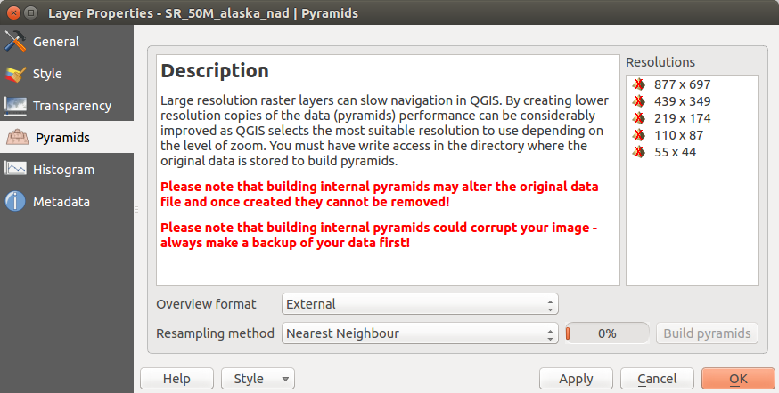
The Pyramids Menu
Bitte beachten Sie dass das Erstellen von Pyramiden die Originaldatei verändern kann und sind sie erstmal erstellt können Sie nicht entfernt werden. Wenn Sie eine ‘nichtpyramidisierte’ Version Ihres Rasters erhalten wollen, machen Sie eine Backupkopie vor dem Erstellen von Pyramiden.
Menü Histogramm
The Histogram menu allows you to view the distribution of the bands
or colors in your raster. The histogram is generated automatically when you open the
Histogram menu. All existing bands will be displayed together. You can
save the histogram as an image with the button.
With the Visibility option in the  Prefs/Actions menu,
you can display histograms of the individual bands. You will need to select the option
Show selected band.
The Min/max options allow you to ‘Always show min/max markers’, to ‘Zoom
to min/max’ and to ‘Update style to min/max’.
With the Actions option, you can ‘Reset’ and ‘Recompute histogram’ after
you have chosen the Min/max options.
Prefs/Actions menu,
you can display histograms of the individual bands. You will need to select the option
Show selected band.
The Min/max options allow you to ‘Always show min/max markers’, to ‘Zoom
to min/max’ and to ‘Update style to min/max’.
With the Actions option, you can ‘Reset’ and ‘Recompute histogram’ after
you have chosen the Min/max options.
Figure Raster 8:
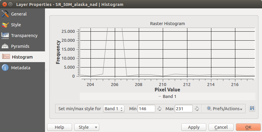
Raster Histogram
Menü Metadaten
Das Metadaten Menü stellt eine Fülle von Informationen über den Rasterlayer dar, einschließlich Statistiken über jeden Kanal im aktuellen Rasterlayer. In diesem Menü können Einträge für Beschreibung, Beschreibung, Metadaten-URL und Eigenschaften gemacht werden. In Eigenschaften werden Statistiken nach dem Prinzip ‘was brauche ich’ erstellt, so dass es gut sein kann dass für einen Rasterlayer noch keine Statistik erstellt oder gesammelt wurde.
Figure Raster 9:

Raster Metadata